


@pikapikamart
Posted
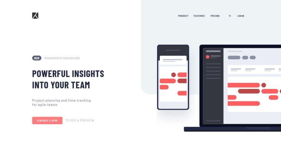
Hey, great work on this one. The layout in desktop is really good, responds well and the mobile state is really good as well.
Some addition suggestions to what Teegamtee already said:
-
The
altfor the website logo should be more descriptive, right now, the only text that we could use is the name of the project itself from fem, thealtcould bealt="project tracking"or if you have a better one. Do not use as well words like "logo, icon, image, picture" as a value foraltattribute. -
The list of links in the
headershould have been wrapped insidenav aria-label="primary"element. So that users will know that this is a navigational links. -
On the
schedule a demolink, you should add ahrefattribute so that it will be properly accessible. Right now, you can't tab on it because the browser doesn't know what it does even if it is aatag. Add thehref. -
On mobile layout, the hamburger menu toggler needs to be a
buttonelement and not adiv. Making it abuttonwill make it more accessible. -
The hamburger
buttonshould have alsoaria-label="hamburger dropdown toggler"so that users will know that thisbuttondoes. Also, it should have aaria-expandedattribute that will be dynamically changed via javascript. This will allow a user to be informed that a dropdown has appeared. -
Also, even if you properly made it a
buttonthe ordering is not proper in your html. What should happen is that, when I use my keyboard to toggler the dropdown, the dropdown appears right, then when I use the tab on my keyboard again, I should be on the links, but it doesn't , because the ordering is wrong. Thebuttonshould come before the list of links:
<button />
<dropdown />
Aside from those, really great work.
Marked as helpful
