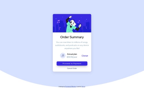
PURE HTML AND CSS

Solution retrospective
Can i make it better? please review it, it would be helpful!! Thanks :)
Please log in to post a comment
Log in with GitHubCommunity feedback
- @hardy333
Hey I have few suggestions:
- add background color after background-image: declaration.
- use more padding on button.
- do not use bold font on everything.
Marked as helpful - @faiyaz-rahman13
hey, everything is nice. do some more practice and improve these things. try to improve the font size, make the font bold. and to make your background make like the challenge picture. make the background on the body tag. set the background picture in CSS. set it as background-img=url(../images/background.....) then set the background as no-repeat, set the background-position on top, and adjust the height and width of the background. make the background as height:100vh. do those and I hope it will help you a lot. thank you.
Marked as helpful - @Everezze
Hi, You need to change the font-size it's too big, and some elements are also bold like title, the button. Instead of setting the card for different width you could set a max-width so for the desktop it will never be longer than that. The annual plan section have a grayish background that you need to set. The transition time on your button might be too long but I'm not sure about this one.
Marked as helpful
Join our Discord community
Join thousands of Frontend Mentor community members taking the challenges, sharing resources, helping each other, and chatting about all things front-end!
Join our Discord