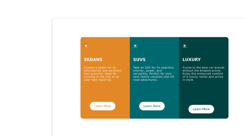
Pure Html and CSS

Solution retrospective
I couldn't figure out how to get rid off the containers white spaces around the content in smaller screens, if anyone has a solution please, do tell :)
Please log in to post a comment
Log in with GitHubCommunity feedback
- @AbNassif
Hey man, A problem I'm seeing is that the container isn't being aligned perfectly in the center, and it's being pushed out of the screen( I have to scroll horizontally then go down vertically to view the cards).
And after some inspection, I've found out that both your HTML and body tags have a fixed height of about 37px. Now usually the container shouldn't be overflowing from the content, But you gave it a fixed height and width along with some fixed margin inside it which forced the parent elements to remain small while the child(.container) has to be bigger which caused it to leave it's parent's confines to abide by the fixed properties.
Adding fixed pixels isn't always optimal as it wouldn't be responsive across all devices like you hope it would.
Things you can change to align the items perfectly:
Add html, body,.container,.wrap{ margin:0; padding:0; width:100%; height:100%; }
then add align-items: center to the div with the class of wrap.(Since you're using flexbox, you don't need to use margin: auto as you can already use align-items to align the elements vertically).
now the cards will somewhat work on all devices with big screens, but as it reaches around 900 px, the items will stretch to the whole width( You can then fix it with media queries by either giving the wrap a percentage width, or some padding).
Important: Most coders usually include this default code in their projects . *(star means select all tags){ margin:0;(will remove the margin as some elements have them by default like the body for example) padding:0;(same reason as the margin); box-sizing:border-box;(people prefer this as it makes adding padding easier, look up how it helps on w3schools, their explanation is better) }
Ps. next time just use one container for the cards (No need for the .wrap element)as that would be enough to manipulate the cards using Flexbox or CSSGrid.
Great work, keep it up and you'll be doing amazingly in no time.
Marked as helpful - @karmatt
So if I understand you correctly no want no white-space around the cards on mobile? You could add:
- { padding: 0; margin: 0; }
That selects all the elements and removes any default padding or margin that is on certain elements by default.


Join our Discord community
Join thousands of Frontend Mentor community members taking the challenges, sharing resources, helping each other, and chatting about all things front-end!
Join our Discord