Solution retrospective
-
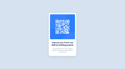
I've taken a mobile first approach and started out with giving my card component a width of 85% at mobile screen width of 375px. While working on the desktop version I set a max-width and later, I also added in a min-width to the card component. I was wondering if the width property is redundant given that the component has a min/max-width now? (Line 66 in CSS code file).
-
I didn't find any differences in the mobile vs desktop version looking at the jpeg files, correct me if I'm wrong.
-
Tried to address accessibility errors I've encountered in my previous project by adding in a landmark (<main role="main">), did I use it properly as I haven't fully understood the landmark error yet?
-
Any best coding practices I could Improve on, even though this is a fairly simple project?
THANKS IN ADVANCE (:
Please log in to post a comment
Log in with GitHubCommunity feedback
No feedback yet. Be the first to give feedback on Sai's solution.
Join our Discord community
Join thousands of Frontend Mentor community members taking the challenges, sharing resources, helping each other, and chatting about all things front-end!
Join our Discord