


Aadvik• 1,250
@Aadv1k
Posted
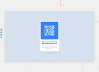
I say this to a lot of developers, but add a media query. challenges like these MIGHT seem to work fine on mobile, in practice they don't. So my tip to you will be to add a media query on smaller screens (say 400px) and change up the padding and/or the width. also you should look into semantic html.
Also look into semantic html; semantic html makes your code easier to read for both you, and someone looking at your code. semantic html is basically.
<article>
 <h2> Title </h2>
 <p> Blah blah </p>
 </article>
  ```
is better and more redable than just putting everything inside a div. For more info You can check this out or you can check some of my projects out to see it in practice.
Marked as helpful
1

