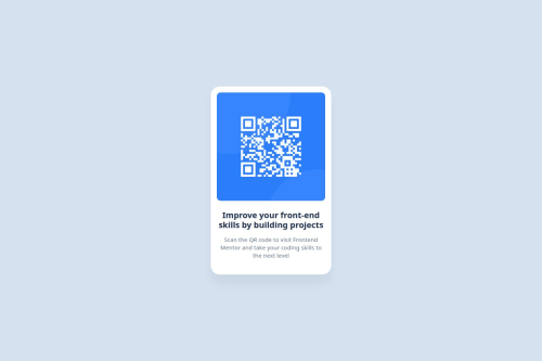
QR Code Card using CSS Grid Layout

Solution retrospective
I learned very interesting insights about the CSS box model when sizing the white card. I used the intrinsic size model with max-width: min-content to size the card according to the width of the image element inside it.
I also used the CSS Grid Layout to center my card and put the attributions block in the bottom center.
What specific areas of your project would you like help with?I would like to know if I took the good approach for centering the elements using CSS Grid and if the intrinsic size model was the right approach to size the white card.
Please log in to post a comment
Log in with GitHubCommunity feedback
- @MarziaJalili
Welcome to this dominating community 🎉🥳🎉
🌟 A quick win for responsiveness?
✅ Using pixels for font size is not a good idea because it doesn’t adjust well on different screen sizes or when users zoom in.
✅ It's better to use units like em or rem so the text can resize more easily and stay readable.
✅ Here you go with an example:
p {
  /* Instead of this...*/
  font-size: 16px;

  /* Try this...*/
  font-size: 1rem;
}
So you could take that num in pixels and divide it by 16 to get the rem value, using calculator of course. 😅
Well played overall — keep being awesome! 😎🔥🥇

Join our Discord community
Join thousands of Frontend Mentor community members taking the challenges, sharing resources, helping each other, and chatting about all things front-end!
Join our Discord