QR Code Challenge

Solution retrospective
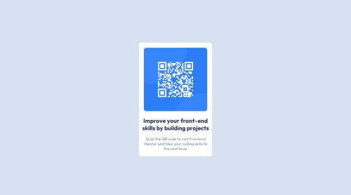
This was my first real challenge product. Attempted to use flex display I have been learning. I definitely had issues with the sizing of the various elements in this challenge. I did a lot of trial and error with DevTools, but think it turned out decent for a first try.
Please log in to post a comment
Log in with GitHubCommunity feedback
- P@danielmrz-dev
Hello @PrimeHouston!
Your solution looks excelent!
I have just one suggestion:
- In order to make your HTML code more semantic, use
<h1>for the main title instead of<h2>. Unlike what most people think, it's not just about the size and weight of the text.
📌 The
<h1>to<h6>tags are used to define HTML headings.📌
<h1>defines the most important heading.📌
<h6>defines the least important heading.📌 Only use one
<h1>per page - this should represent the main heading/title for the whole page. And don't skip heading levels - start with<h1>, then use<h2>, and so on.This change has little or not effect at all on the project, but it makes your HTML code more semantic, improving SEO optimization as well as the accessibility of your project.
I hope it helps!
Other than that, you did a great job!
Marked as helpful - In order to make your HTML code more semantic, use
- P@Islandstone89
Hi, congratulations on submitting your solution! Here are some tips, I hope it helps :)
HTML:
-
Every webpage needs a
<main>that wraps all of the content, except for<header>andfooter>. This is vital for accessibility, as it helps screen readers identify the "main" section of a page. As the card is the only main content, you can change.cardinto a<main>. I would also remove the.container, as it is not needed. -
The alt text should not include words like "image" or "photo". Screen readers start announcing images with "image", so an alt text of "QR code image" would be read like this: "image, QR code image". Also, the alt text must say where it leads(frontendmentor.io).
CSS:
-
It's good practice to include a CSS Reset at the top.
-
heightshould bemin-height- this way, the content will not get cut off if it grows beneath the viewport. -
Remove all fixed widths in
px. You rarely want to set fixed widths, as this causes issues like overflow when the screen is smaller than the set width. NB: Also, never set fixed heights! -
Add a
max-widthof around20remon the card, to prevent it from getting too wide on larger screens. -
On the image, add
display: blockandmax-width: 100%- the max-width prevents it from overflowing its container. -
To create the space between the image and the edge of the card, set
paddingon all 4 sides of the card. -
Don't use
%on margins. -
font: size 15px;doesn't do anything, because it is an invalid value. It should be:font-size: 15px;. However...font-sizemust never be in px. This is bad for accessibility, as it prevents the font size from scaling with the user's default setting in the browser. Use rem instead.
Marked as helpful -


Join our Discord community
Join thousands of Frontend Mentor community members taking the challenges, sharing resources, helping each other, and chatting about all things front-end!
Join our Discord