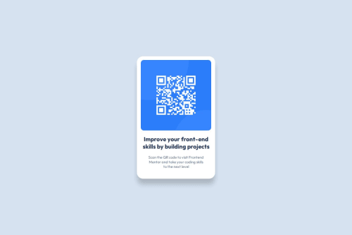
QR Code Component - Refactor

Solution retrospective
Flexbox has not been my favorite, but for this project I feel more confident in using it. What I'd do differently next time is make the main background in the body of CSS rather than in the container
What challenges did you encounter, and how did you overcome them?One of my challenges was with using margin and padding to make items align properly. To overcome this, I'd test margin and/or padding in a ruleset to see how it affected the content placement. This helped me to better understand how they work better.
What specific areas of your project would you like help with?I'd like feedback on how others planned their project. For instance, I saw two different ways of going about making the background light blue. And sometimes it's in seeing more than one perspective that I got confused (with things like flexbox). How do you plan and focus to get projects like this completed?
Please log in to post a comment
Log in with GitHubCommunity feedback
- @ardolynk-reborn
Looks fine, but attribution section is offscreen (a bit of scrolling needed). You'd better place it into an external
divwithheight: 100vh. My solution looks like:<div class="main"> <div class="content"> <div class="card"> #card content </div> </div> <div class="attribution"> #attribution content </div> </div>.main { height: 100vh; display: flex; flex-direction: column; align-items: center; } .content { height: 100%; display: flex; flex-direction: column; justify-content: center; }Marked as helpful
Join our Discord community
Join thousands of Frontend Mentor community members taking the challenges, sharing resources, helping each other, and chatting about all things front-end!
Join our Discord