Not Found
Not Found
Not Found
Not Found
Not Found
Not Found
Not Found
Not Found
Not Found
Not Found
Not Found
Not Found
Not Found
Not Found
Not Found
Not Found
Not Found
Not Found
Not Found
Not Found

Submitted

Qr code component

@vvvasavii

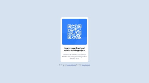
Desktop design screenshot for the QR code component coding challenge

This is a solution for...

  • HTML
  • CSS
1newbie
View challenge

Design comparison


SolutionDesign

Solution retrospective


What are you most proud of, and what would you do differently next time?

I'm mostly proud of how i was actually able to build my first ever project and use version controls correctly.I'm also quite proud of how i didn't just give up and cheat my way out of this with countless challenge solutions on ytube. Next time i would be more precise with my code and will hopefully try to complete it a bit early.

What challenges did you encounter, and how did you overcome them?

Although very basic but flexbox gave me a hard time even though i thought i had the basics down clearly. i overcame it by deepening my understanding of flexbox.

What specific areas of your project would you like help with?

Pls read my code and tell me the unecessary or redundant piece of codes,if you happen to have some spare time.Also pls provide any critical feedback,even and especially the negative ones.Thank you in advance.

Community feedback

Masseh 210

@Masseh2025

Posted

By the way I noticed that you used alot of ids in your code, I think you would be fine just using class names for the most part unless you really need them and remove the unnecessary "child" classes and try to make the names a little more descriptive. For exmaple instead of naming your img "img" I would name it qr-code-img.

Marked as helpful

0

@vvvasavii

Posted

@Masseh2025 thanks, I'll keep that in mind for sure.

0
T
Grace 28,970

@grace-snow

Posted

I hope this feedback is helpful

  1. Don't set all those styles on the HTML element. You will hardly ever have to touch the html selector in your styles. The html doesn't need to be a flex element or styled at all, and the height: 100%; is causing breakage -- a really nasty overflow bug for people who need to zoom text or use a larger text size. Remove all those styles from html and leave them on the body.
  2. The body needs a min height in viewport units. Default the body is only as tall as its content which means in this case because the content is only a small card the height of the body is very small. That's why you need to give it a min height. Tell it to be at least as tall as the viewport e.g. min-height: 100svh.
  3. All content should be contained within landmarks. This needs a main wrapping the card and a footer for the attribution. Every page should at least have a main Element and there should only ever be one of them.
  4. Avoid using keywords like Min or max content. These are advanced topics and they won't work how you expect them to work. This card does not need it. The card needs a single max width in rem.
  5. To stop the Page contents from hitting the screen edges you either need to give that content a small margin on all sides or you need to give a wrapping element some small padding on all sides. For example in this case you could add a little padding to the body or to the landmarks.
  6. Make sure you understand the difference bttween padding and margin. The image doesn't need padding, only the card does.
  7. This is invalid html: width="250px" height="250px". Those attributes must not have units inside them. The browser would read them as pixels anyway. But really you need to understand what they're therefore if you want to include them. The purpose is for the browser to be able to calculate aspect ratio of that image and save the space for the image, thus improving performance slightly. You could put width 600 x 600 if you wanted and it would do the exact same thing -- tell the browser this image is square (i.e. it has an aspect ratio of 1). If you choose to include a width and height attribute you will need to set this image to be 100% wide in the CSS. Whether or not you include width and height this image should be styled to display block and max width 100% both of which are usually included in a standard CSS reset.
  8. Get into the habit of always including a full modern CSS reset at the start of your styles in every project. Andy Bell or Josh Comeau both have good examples you can look up and use.
  9. Image elements must always have an alt attribute. This image in particular is extremely important content in the component so it must have a proper description within that alt attribute. In this case, the alt must say what the image is (QR code) and where it goes to (to frontendMentor.io).
  10. Don't wrap everything in a div!! You only need a div for block element styling or span for in-line element styling. Only add them when necessary. You don't need to wrap every single element in one of these. Keep the HTML as simple as possible.
  11. Instead you must use meaningful HTML elements. I can't stress how important this is. It is extremely important, more important than anything else. Like in architecture the HTML is the foundations of the building you build on -- if you get that wrong everything is wrong. You need to look at a design, think about the content and carefully translate that content into the most appropriate meaningful HTML elements. It it is an essential skill. This card is made up of an image with meaningful description. a heading and a paragraph. Other challenges you do unlikely to have more HTML elements such as Lists, headings which need to be in the right order, buttons for actions, links for navigation, tables for tabular data etc.
  12. Never style on IDs. That's not what they're for. Use single class selectors wherever possible. That will keep your CSS specificity as low as possible, which is a very good thing, making styles much easier to manage.
  13. Remember in CSS order really matters. You mustn't ever have reset styles or wildcard selectors at the end of your CSS. This will override earlier styles and lead to horrible bugs. Styles lower in the style sheet will override what has been written above. This is called the Cascade and it is core to how CSS works -- Cascading Style Sheet. This will become even more important in later larger challenges.
0

@vvvasavii

Posted

Thank you sm for such a detailed review.ill keep each and every point in mind from now on@grace-snow

0
Masseh 210

@Masseh2025

Posted

Overall its pretty good, but one thing I would probbaly to make the solution a little bit bigger.

0

v-mis 0

@v-mis

Posted

Thanks for the feedback.Also,do i just increase the width and length of the container or would i have to work on elements themslef(image, text) to make it bigger. @Masseh2025

0
Masseh 210

@Masseh2025

Posted

@v-mis so like what i did was like was look in the figma file and like saw that the frame had a width of 320px and a height of 497px (which I rounded to 500px for convience) and saw that the img had a width and height of 288px so I sized them that way. I think you did pretty well on the text however.

0

@vvvasavii

Posted

@Masseh2025 thank you for the help, i really appreciate it. Also i was quite confused with the whole figma thing so i just chose random numbers for sizes. (thank you once again for all your feedbacks,it helps me a lot :))

0
T
Grace 28,970

@grace-snow

Posted

@Masseh2025 you should not be adding a width to components like this, and definitely not a height. Instead, components like this should have a max-width only and this needs to be in rem so that the layout scales correctly for all people, including those of us who have to change our default text size.

Never limiting the height of elements that contain text in any child elements is an even more important concept. As soon as you set a height limit, you will make a fragile solution that will break for people, causing overflow. For example, consider an author adds/removes more text, a user increases the text size, spacing or font family, or someone translates the page into another language. All of those things would change the height that is required. It is the browser's job to decide what height is needed based off the contents within the component/page and the settings applied.

1

Please log in to post a comment

Log in with GitHub
Discord logo

Join our Discord community

Join thousands of Frontend Mentor community members taking the challenges, sharing resources, helping each other, and chatting about all things front-end!

Join our Discord