


@MelvinAguilar
Posted
Hello there 👋. Congratulations on completing your first challenge! You have done a great job and I can see you are on the right track.
I have some suggestions about your code that might interest you.
Center
-
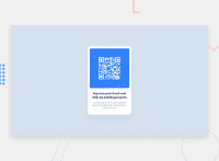
With margins you won't be able to center it correctly, for example, on mobile devices, there will be a large space above the component due to the use of "margin-top: 20vh".
This photo is how your solution looks on a mobile device: screencapture
- Centering an element with
position: absolutewould make your element behave strangely on some screen sizes, "there's a chance the content will grow to overflow the parent".
- The best ways to align elements in a container is to use Flexbox or Grid layout. You can read more about centering in CSS here 📘.
Box
-
The box-sizing property in CSS is used to tell the browser how to calculate the total width and height of an element. By default, the box-sizing of an element is set to
content-box, which means that the width and height properties are measured including only the content, but not the padding or border.Using content-box can be beneficial in some cases. However, it can also be problematic in certain situations where elements need to be sized accurately.
- You should use the
box-sizing: border-boxproperty to make thewidthandheightproperties include the padding and border of the element. This will make it easier to calculate the size of an element. You can read more about this here 📘.
I hope you find it useful! 😄
Happy coding!
Marked as helpful
@welderessutti
Posted
@MelvinAguilar
Thank you for your feedback!! I'll test these suggestions.


