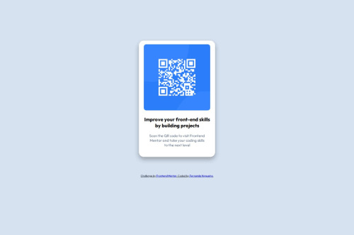
Qr code component

Solution retrospective
What I'm proud of: Pixel-perfect execution – Matched the design exactly with proper spacing, alignment, and responsive behavior. Accessibility focus – Used semantic HTML and proper alt text for the QR image. Clean code – Organized CSS with clear class names and logical structure.
What I'd improve next time: CSS variables – Replace hardcoded values with custom properties for easier maintenance. Performance check – Audit bundle size and optimize assets (though simple here, good practice). Enhanced interaction – Add subtle hover effects or focus states for better UX. Cross-browser testing – Verify rendering consistency beyond Chrome/Edge.
Key takeaway: This project solidified my layout skills, and I’m now eager to implement more scalable CSS approaches in future challenges.
What challenges did you encounter, and how did you overcome them?Challenges Faced & Solutions:
Responsive Sizing
Challenge: Keeping the card proportionally sized on very small/large screens.
Fix: Used max-width with relative units (% + rem) and tested on Chrome DevTools’ device simulator.
Center Alignment
Challenge: Vertically centering the card without flex/Grid (for learning purposes).
Fix: Applied margin: auto with positioned layout as a fallback.
Color Matching
Challenge: Design’s subtle hsl() values looked different on my monitor.
Fix: Extracted exact colors using Figma’s eyedropper tool.
GitHub Pages Setup
Challenge: Initial deploy failed due to repo naming.
Fix: Renamed repo to username.github.io (required for root-level projects).
Lessons Learned:
Always test early on real mobile devices.
Double-check GitHub’s docs for deployment quirks.
What specific areas of your project would you like help with?Areas I'd like help with:
Code Review:
Is my HTML semantic enough? (e.g., did I overuse <div>?)
Could my CSS be more efficient? (e.g., reducing redundancy)
Best Practices:
Better way to handle the responsive layout? (Flexbox vs. Grid)
Accessibility checks beyond alt text.
Advanced Tips:
How to make the QR code interactive? (e.g., click animation)
Git strategy for tiny projects (branching needed?).
(Specific questions = better feedback!)
Example focused ask: “Is margin: 0 auto the cleanest way to center this card, or would Flexbox be more maintainable?”
Please log in to post a comment
Log in with GitHubCommunity feedback
- @KapteynUniverse
Hey Fernanda, nice job.
Is my HTML semantic enough? (e.g., did I overuse <div>?)I didn't see more than 1 div. It is ok. Think divs as layout containers. I recommend you to check landmarks and every element on MDN site.
Maybe you can use article for the container. But wrap qr code container with a main. Every page needs 1 main.
Alt texts should be descriptive, unless the img is decorative. So in this case something like "QR code leading to frontendmentor.io" might be better.
Break rules <br> are bad for accessibility, i am not sure if there is a usage for br besides poetry or address. If you want to make the text exactly like the design, you can give apply padding or max-width.
Could my CSS be more efficient? (e.g., reducing redundancy)Instead of
height: 100vh;usemin-height: 100vh;on the body, so it can grow if it needs to.Most of the times, you don't need to set height for the elements. For example, you can use
.qr-code {
    /* height: 270px; */
    /* width: 270px; */
    max-width: 100%;
    display: block;
    border-radius: 10px;
}
position: relative;on the container seems unnecessary.I recommend you to use a modern css reset for every project. You can check Andy Bell's reset too.
Better way to handle the responsive layout? (Flexbox vs. Grid)I don't know if you start with desktop or mobile layout, since this is a small component but for future projects starting with mobile is always easier.
Chosing between flex or grid depends. It is user preference. Like bento grid challenge, you can make it with flex but it is better to use grid.
It is always better to use max-width and never set font-size as px like Marzia said.
Sometimes using clamp() function might be helpful.
“Is margin: 0 auto the cleanest way to center this card, or would Flexbox be more maintainable?”Depends. I use
margin-inline: auto;if i just want to center the element horizontaly. To center everything inside the body, flex or grid. Depending on the design, flex or grid again.How to make the QR code interactive? (e.g., click animation)You can put img into an anchor element and use :hover and :focus pseudo classes.
You can also use click listener with js or :focus + tabindex with css and html but i won't recommend adding interactibility on a non interactable element.
- @MarziaJalili
Yo, props to you for discovering this incredible spot! 🎉🥳🎉 — this community is gold! 😎
🌟 A quick win for responsiveness?
✅ Using pixels for font size is not a good idea because it doesn’t adjust well on different screen sizes or when users zoom in.
✅ It's better to use units like em or rem so the text can resize more easily and stay readable.
✅ Here you go with an example:
p {
  /* Instead of this...*/
  font-size: 16px;

  /* Try this...*/
  font-size: 1rem;
}
So you could take that num in pixels and divide it by 16 to get the rem value, using calculator of course. 😅
Well played overall — keep being awesome! 😎🔥🥇


Join our Discord community
Join thousands of Frontend Mentor community members taking the challenges, sharing resources, helping each other, and chatting about all things front-end!
Join our Discord