
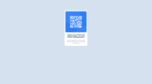
Solution retrospective
Hello, leave me comments to my exercise.
Thank You!!
Please log in to post a comment
Log in with GitHubCommunity feedback
- Account deleted
Hi @maria-js you did great on your first project !!
To Center the card (horizontally and vertically) u can use display flex on the
<body>instead on margins on the<header>body{
           ` width: 100vw;  ` to make body width equal to screen width

           ` height: 100vh; ` to make body height equal to screen height

           ` display: flex; ` set display mode for body as flex

           ` align-items: center; ` to center items inside the body vertically

           ` justify-content: center; `  to center items inside the body horizontally
}
Marked as helpful - @jonathan401
Congrats on completing this challenge @maria-jose :). You did a really good job :). Just a few suggestions though.
-
To fix your accessiblity issues you should wrap you whole card component in a
maintag. -
Also, it is a good practice as well as required by the WCAG guide that every page should contain one h1 element. This provides a good way for users that with disablities like coordinative abilities or users that find it hard to see to easily navigate your site (or your page).
-
This is a small project so this might much be very important but you should consider adding classes to your html elements. This will make it easier for you to style the elements when you're working on a large project in the future. For example, when you have a lot of
pelements in your page, adding a class to each of thesepelements could save you a lot because in you might want to style apelement different from anotherpelement. I hope you get that ;). This article by w3schools might provide better understanding on this concept. Feel free to do more research on this :). -
I noticed in your css that you were using absolute units to style your css. This is good in some cases but it leads to your site to break and not responsive. You should consider using relative units like
% or reminstead ;). (You don't have to do this though, It depends on what you are building). You could check out this article by freecodecamp.
I have to apologize for making this so long :). Congrats on completing the challenge :). Happy Coding :D.
Marked as helpful -

Join our Discord community
Join thousands of Frontend Mentor community members taking the challenges, sharing resources, helping each other, and chatting about all things front-end!
Join our Discord