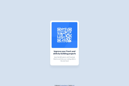
Solution retrospective
I'm most proud of how I decided to style my body element. I think I would try out CSS variables if I could do it differently.
I first struggled to figure out how to center the .container class vertically. I first did margin: auto;, which only centered the card horizontally but not vertically. Then I tried,
display: flex;
justify-content: center;
align-items: center;
Which didn't fix it. So to get a better idea of how things were positioned I made use of the "box model" concept, kept the flex properties and set a border to all elements using the * selector with border: 1px solid red;. Turns out the body height was too small so I did min-height: 100vh;. This fixed my problem and the card was now centered both horizontally and vertically.
Please log in to post a comment
Log in with GitHubCommunity feedback
- @bhuvi819381
Hey brother 👋
🚀 Your solution looks great! Keep it up! 🎉
Suggestions for Improvement:
- 🛠 Use Semantic Tags
Wrap your main content inside a <main> tag instead of a <div>.
Use <section>, <article>, <footer>, etc., to improve structure.
- 📏 Avoid Fixed Heights
Instead of height: 500px;, use min-height: 100vh; if needed.
Let content define its own height to make it more responsive.
- ❌ Don’t Use px
Instead, use relative units like rem, em, %, vh, or vw for better responsiveness.
- Use 1 h1 per page
- Fix Heading Hierarchy
Ensure headings follow a logical order (h1 → h2 → h3…). This improves SEO & accessibility.
Additional Suggestions:
🛠️ Check for Errors: After submitting, always review the HTML & accessibility error report and fix any issues.
🔥 You're improving with every project! Keep it up! 🚀
Best regards, A Frontend Friend
Marked as helpful - P@kaamiik
Your code structure really well and CSS is very good too. Congrats. Just a few notes:
- Try to use a proper CSS reset at the start of your CSS style. Andy Bell and Josh Comeau both have a good one. You can simply search on the internet to find them. It may not very usable here but in the future you need.
- You do not need
position: relative; bottom: -200px;. This cause scrolling and it's not proper. You should use flex here. Your body isdisplay: flex;so You have two child and one of them should grow. You also need a little change into your html and css as the main should not get any style and use a div as a direct child of main and put all of your contents inside of it.
Join our Discord community
Join thousands of Frontend Mentor community members taking the challenges, sharing resources, helping each other, and chatting about all things front-end!
Join our Discord