Submitted 19 days agoA solution to the QR code component challenge
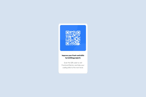
QR code component
bootstrap

@Mahi-Mani
Solution retrospective
What challenges did you encounter, and how did you overcome them?
I was struggling to center the content horizontally and vertically
Code
Please log in to post a comment
Log in with GitHubCommunity feedback
- @thisisharsh7
Nice work on completing the challenge! 🎉 Your use of custom CSS is clean and readable.
✅ What’s working well:
- You’ve used semantic tags and kept the structure minimal.
- The centering with
.centerclass usingflexboxis correctly done.
🔧 Some suggestion:
- Card Styling: The card's border-radius is slightly too curved. The original uses around
20px— tryborder-radius: 20pxfor both.cardand.card-img-top. - Typography: Avoid nesting block elements like
<div>inside<p>(HTML5 disallows this). Instead, structure with<div class="title">and<div class="subtitle">only, and handle text inside using<p>tags directly. - Card Width: You can improve responsiveness by avoiding inline styles like
style="width: 18rem;". Use a utility class or media query for adaptive sizing. - Vertical Spacing: Add some
margin-topandmargin-bottomto the text elements inside.card-bodyto improve breathing room.
Great start overall — happy coding! 🚀

Join our Discord community
Join thousands of Frontend Mentor community members taking the challenges, sharing resources, helping each other, and chatting about all things front-end!
Join our Discord