Skip to content
  • Unlock Pro
  • Log in with GitHub
Solution
Submitted over 2 years ago

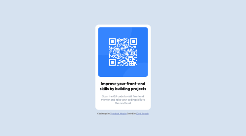
QR Challenge using Flex box

Keith Grizzle•40
@grizzle83
A solution to the QR code component challenge
View live sitePreview (opens in new tab)View codeCode (opens in new tab)

Solution retrospective


Been learning for about 2 months. Haven't learned much about responsive design yet so only did the desktop version.

Still unsure if I'm doing the image sizing correct and find it hard to center things in css.

Sure it's not the most efficient way to code this so any suggestions or helpful tips would be much appreciated. Thanks

Code
Select a file

Please log in to post a comment

Log in with GitHub

Community feedback

  • Adriano•42,870
    @AdrianoEscarabote
    Posted over 2 years ago

    Hello Keith Grizzle, how are you? Welcome to the community of front-end mentors! I truly loved your project's outcome, however I have some advice that I hope you'll find useful:

    To align some content in the center of the screen, always prefer to use display: flex; it will make the layout more responsive!

    Example:

    body {
        margin: 0;
        padding: 0;
        display: flex;
        align-items: center;
        flex-direction: column;
        justify-content: center;
        min-height: 100vh;
    }
    

    Prefer to use background-color in the body to avoid what is happening so that it doesn't break the background color due to max-width

    The remainder is excellent.

    I hope it's useful. 👍

    Marked as helpful
  • Vanza Setia•27,715
    @vanzasetia
    Posted over 2 years ago

    Hi, Keith!

    First, I recommend removing width: 1440px; and and height: 1056px; from the .container styling. This makes the page not responsive since you force the page to be that exact size on all screen sizes.

    Also, you can make the site responsive by only setting a max-width: 325px to the card element. This way, the card is allowed to shrink if there is not enough space. So, set max-width and remove width.

    For <img> styling, I recommend making the <img> as a block element and set max-width: 100%. It makes working with <img> easier.

    To make the card in the middle of the page, I recommend making the <body> element as the flex container of the card. Then, set min-height: 100vh to make the card vertically in the middle of the page.

    I hope this helps. Let me know if you have any questions.

    Marked as helpful
  • dmoquia•240
    @dmoquia
    Posted over 2 years ago

    Hello, Nice work. My suggestion is you may use main tag instead of div. This may improve acccessability for users. on the css, on the container class you may take off the height/width and replace it with height of 100vh instead.

Join our Discord community

Join thousands of Frontend Mentor community members taking the challenges, sharing resources, helping each other, and chatting about all things front-end!

Join our Discord
Frontend Mentor logo

Stay up to datewith new challenges, featured solutions, selected articles, and our latest news

Frontend Mentor

  • Unlock Pro
  • Contact us
  • FAQs
  • Become a partner

Explore

  • Learning paths
  • Challenges
  • Solutions
  • Articles

Community

  • Discord
  • Guidelines

For companies

  • Hire developers
  • Train developers
© Frontend Mentor 2019 - 2025
  • Terms
  • Cookie Policy
  • Privacy Policy
  • License

Oops! 😬

You need to be logged in before you can do that.

Log in with GitHub

Oops! 😬

You need to be logged in before you can do that.

Log in with GitHub

How does the accessibility report work?

When a solution is submitted, we use axe-core to run an automated audit of your code.

This picks out common accessibility issues like not using semantic HTML and not having proper heading hierarchies, among others.

This automated audit is fairly surface level, so we encourage to you review the project and code in more detail with accessibility best practices in mind.

How does the CSS report work?

When a solution is submitted, we use stylelint to run an automated check on the CSS code.

We've added some of our own linting rules based on recommended best practices. These rules are prefixed with frontend-mentor/ which you'll see at the top of each issue in the report.

The report will audit all CSS, SCSS and Less files in your repository.

How does the HTML validation report work?

When a solution is submitted, we use html-validate to run an automated check on the HTML code.

The report picks out common HTML issues such as not using headings within section elements and incorrect nesting of elements, among others.

Note that the report can pick up “invalid” attributes, which some frameworks automatically add to the HTML. These attributes are crucial for how the frameworks function, although they’re technically not valid HTML. As such, some projects can show up with many HTML validation errors, which are benign and are a necessary part of the framework.

How does the JavaScript validation report work?

When a solution is submitted, we use eslint to run an automated check on the JavaScript code.

The report picks out common JavaScript issues such as not using semicolons and using var instead of let or const, among others.

The report will audit all JS and JSX files in your repository. We currently do not support Typescript or other frontend frameworks.

Oops! 😬

You need to be logged in before you can do that.

Log in with GitHub

Oops! 😬

You need to be logged in before you can do that.

Log in with GitHub

Oops! 😬

You need to be logged in before you can do that.

Log in with GitHub