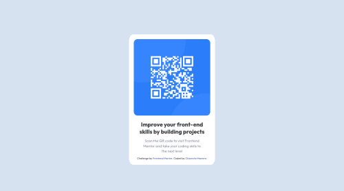
Submitted about 3 years agoA solution to the QR code component challenge
Mobile-first Solution using bootstrap 4 and CSS media queries

@okiemute2019
Solution retrospective
This project tested my knowledge of class heirarchy alot. Was it wise to utilize bootstrap to improve responsiveness?
Did I use CSS media queries correctly?
Is my CSS code standardized enough?
Code
Loading...
Please log in to post a comment
Log in with GitHubCommunity feedback
No feedback yet. Be the first to give feedback on Okiemute Mariere's solution.
Join our Discord community
Join thousands of Frontend Mentor community members taking the challenges, sharing resources, helping each other, and chatting about all things front-end!
Join our Discord