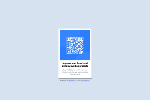
Solution retrospective
I was able to replicate the design as closely as possible.
What challenges did you encounter, and how did you overcome them?Positioning the container to the center of the screen even after using the flex properties. I used the margin-top to overcome this issue.
What specific areas of your project would you like help with?I would like to know about other methods using CSS which I can implement to complete this challenge. How can I improve my current CSS code and common practices I should follow while writing CSS code.
Please log in to post a comment
Log in with GitHubCommunity feedback
- @hitmorecode
Nice well done. These are the few things you can change in your CSS
margin: 0;on the body, you can place it inside the CSS resetmarginon theh1andptag can be removed, instead addpaddingon the.container.paddingon the image can also be removed if you add padding on the.container.- To place the center of the page add this on the
body.
body {
    /* margin: 0; */
    background-color: hsl(212, 45%, 89%);
    font-family: 'Outfit', sans-serif;
    // add these lines
    min-height: 100vh;
    display: flex;
    flex-direction: column;
    justify-content: center;
    align-items: center;
}
I hope you find this helpful. Keep it up 👌👍
Marked as helpful - @sanchesaline6
I used CSS variables to define properties like colors and spacing. You missed applying the h1 color, as shown in the Figma file. You should try to learn about using flexboxes; it would've helped you with the positioning issue you mentioned. Also on the Figma file you would find some tips about the size of the content and the qr-code image, spacing, gaps, etc.
Marked as helpful
Join our Discord community
Join thousands of Frontend Mentor community members taking the challenges, sharing resources, helping each other, and chatting about all things front-end!
Join our Discord