


Lucas 👾• 104,560
@correlucas
Posted
👾Hello @shwetanegi30, congratulations for your first solution and 😎 welcome to the Frontend Mentor Coding Community!
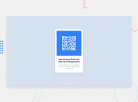
Your solution is great but is not responsive yet, this is due the image that has a fixed width, note that you need to replace width: 240px with max-width: 100% to make the image grow 100% of the container.
.qr {
    max-width: 100%;
    /* width: 250px; */
    border-radius: 5%;
    margin-top: 25px;
    display: block;
}
To make your image fully responsive add display: blockand max-width: 100% and object-fit: cover to make the image auto-crop when resizing inside the column:
img {
    display: block;
    object-fit: cover;
    max-width: 100%;
}
👋 I hope this helps you and happy coding!
1
