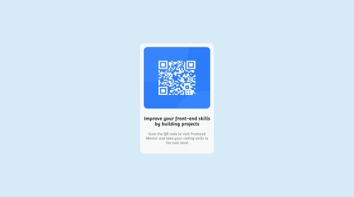
QR code component

Please log in to post a comment
Log in with GitHubCommunity feedback
- @MelvinAguilar
Hello there 👋. Good job on completing the challenge !
I have some suggestions about your code that might interest you.
HTML 🏷️:
- The text
Improve Your Front-End Skills by Building Projectsis considered a heading element (h1).
CSS 🎨:
- Use more descriptive class names to improve readability of front-end code. You can learn BEM naming convention to improve your class names.
- Use
min-height: 100vhinstead ofheight. Setting the height to 100vh may result in the component being cut off on smaller screens, such as a mobile phone in landscape orientation.
I hope you find it useful! 😄 Above all, the solution you submitted is great!
Happy coding!
Marked as helpful - The text
- @jrleijnse
Hey there! Great job completing your first challenge! 🎊
I have some suggestions for your code that might interest you.
HTML 📄:
- If an
<img>like in this case the QR-code, leads to a website or links to someplace else, try to provide a more descriptive text of that in yourALTtext, for example: QR code that leads to frontendmentor.io - Try using the font that is provided in the style-guide file. You can do this by generating the font using the link in the styling-guide and paste the
<link>inside of the<head>in your<HTML>.
CSS 🎨:
- To make your project more responsive and adaptable (in this case as well: especially when you start building bigger and bigger projects), I would suggest to use rem instead of px. This basically means that all sizing will be calculated in relation to the root element (rem). To set the standard font-size for the root element, you can provide a font-size inside the HTML element inside your CSS. For example:
html {font-size: 15px;}.
For more information on this topic, you can read the following article: PX or REM in CSS? 📘
- To make your solution responsive for different devices and screen widths, you can create a media query inside your CSS file and set the breaking point (i.e. the moment your media query gets triggered based on the width of the viewport). For example:
@media (max-width: 375px) { ***Place your CSS code here, just like you would in a regular CSS file***}.
For more information on this topic, you can read the following article: Media queries 📘
I hope you find my suggestions useful, and above all: the solution you provided is very good!
Keep it up and happy coding! 😃
Marked as helpful - If an


Join our Discord community
Join thousands of Frontend Mentor community members taking the challenges, sharing resources, helping each other, and chatting about all things front-end!
Join our Discord