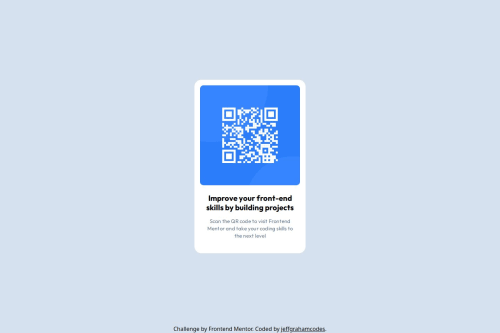
QR code component

Solution retrospective
I’m most proud of how clean and organized the code turned out for this project. I paid attention to using semantic HTML and structured my CSS file thoughtfully, incorporating best practices like a CSS reset and custom properties. The final design feels polished, and the alignment of elements, especially the QR code and text, works well. It’s rewarding to see how consistent and visually appealing the result is. If I were to approach this project again, I’d focus on adding more detailed comments in my CSS to improve maintainability. I’d also prioritize testing on smaller screen sizes and adding additional media queries to ensure an even better mobile experience.
What challenges did you encounter, and how did you overcome them?My biggest challenge was learning how to decipher the Figma file and translate the design into CSS. Understanding the spacing, font sizes, and layout properties in Figma and then implementing them accurately in code required a lot of focus and trial and error. To overcome this, I took the time to study the Figma interface and paid attention to the details, like margin and padding values, font weights, and colors. It was a learning curve, but breaking the design down into smaller, manageable parts really helped.
What specific areas of your project would you like help with?Specifically, I’d appreciate feedback on whether I accurately translated the Figma file to the web version. Did I effectively match the layout, spacing, font sizes, and overall visual design? I’d also welcome suggestions for any areas where the translation could be improved to better reflect the original Figma design.
Please log in to post a comment
Log in with GitHubCommunity feedback
No feedback yet. Be the first to give feedback on jeffgrahamcodes's solution.
Join our Discord community
Join thousands of Frontend Mentor community members taking the challenges, sharing resources, helping each other, and chatting about all things front-end!
Join our Discord