


Nneoma Njoku• 1,210
@SatellitePeace
Posted
Hello @OgunremiZainab congrats on completing this challenge
-
to answer your questions
-
the light grey color is meant to cover the entire screen which means the light grey should be placed on the body element
body{
background-color: lightgray;
}
- The width property determines how wide the content of your project will be so the width property should be set to the container element and not the body
main{
max-width: 375px;
width: 100%
}
````

- I recommend that you use mobile-first approach in most cases or all the time if possible.
mobile-first approach simply means designing the layout for the phone first and using media queries to change certain styles to suit bigger screens like tablets and desktops

- If you are using mobile-first approach, your media query will look like this

````
@ media screen and (min-width: 768px){
main{
max-width:700px;
width: 100%
}
}
````

- then if you are using a desktop-first approach your media query will have a max-width like so

````
@ media screen and (max-width: 375px){
main{
max-width:300px;
width: 100%
}
}
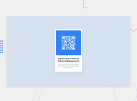
- On the small screen your card looks great but on the large screen it does not, try setting the main container enclosing your contents to a max-width of 375px and a width of 100%, and also add a margin of 3rem to your body like so
body{
margin: 3rem;
}

mainContentContainer{
max-width: 375px;
width: 100%;
}
I hope this helps
Marked as helpful
0
