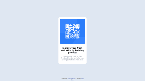
Submitted about 3 years agoA solution to the QR code component challenge
QR Code Component: centered vertically and horizontally using position

@dboca93
Solution retrospective
Hello,
Feedback welcome for my first frontend mentor task. I'm new to web-dev and I'm keen to learn more. I imagine there are easier ways to complete this task using CSS Grid (which I'm currently learning) -- is this correct?
Also, could someone comment on whether the sylistic changes I made on smaller screen sizes (via media queries) are correct ? Is the read-me file ok ? All other feedback is more than welcome. Thanks !
Code
Loading...
Please log in to post a comment
Log in with GitHubCommunity feedback
No feedback yet. Be the first to give feedback on Dilhan Boca's solution.
Join our Discord community
Join thousands of Frontend Mentor community members taking the challenges, sharing resources, helping each other, and chatting about all things front-end!
Join our Discord