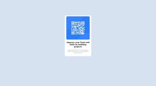
QR Code Component - First challenge finished!

Solution retrospective
Hey! Just finished my first challenge on FrontEndMentor but I have a question.
When I apply align-content: center to my flex container it won't align it in the middle of the page vertically. I don't know if I'm missing something or using a wrong attribute for what I'm trying to do.
My solution to make it look somewhat in the middle was to apply a margin-top to the container but I don't know if this is a good way to do it or not.
I will very much appreciate the feedback.
Thanks! :)
Please log in to post a comment
Log in with GitHubCommunity feedback
- @MelvinAguilar
Hi @luisoliverosrdn, good job for completing this challenge! 👋
Here are some suggestions to improve your code:
-
To align a element it in the middle of the page vertically with flexbox you need to set the height of the containing element, Although the flex layout should be used in your body to center the .card element,
height: 100vh; -
Image dimensions become larger than required when viewed from a higher resolution
I suggest you modify the styles in this way:
.body { width: 100%; min-height: 100vh; display: flex; flex-direction: column; justify-content: center; align-items: center; background-color: hsl(212, 45%, 89%); } .card_container { /* display: flex; */ /* flex-direction: column; */ /* align-items: center; */ /* justify-content: center; */ /* margin: 10% auto; */ /* width: 17vw; */ background-color: white; max-width: 230px; /* This set the maximum width of the .card*/ border-radius: 10px; padding: 10px; } .card_img { /* width: 15vw; */ /* margin: 0.5rem; */ width: 100%; height: auto; object-fit: contain; border-radius: 10px; } .card_text { /* width: 15vw; */ text-align: center; font-family: outfit; margin: 0.5rem 0; }- You can use either the CSS @import rule to import the font-family Reference
In your CSS file add:
@import url("https://fonts.googleapis.com/css2?family=Outfit:wght@500;700;900&display=swap");And use it as follows
font-family: "Outfit", sans-serif;- Try to use semantic tags in your code. More information here:
Without semantic tags:
<body>
   <div class="card">
   </div>
<body>
With semantic tags:
<body>
   <main class="card">
   </main>
<body>
More information:
A Complete Guide to Flexbox (CSS-Tricks) |
https://www.w3schools.com/howto/howto_css_center-vertical.asp |
CSS Layout - Horizontal & Vertical Align
I hope those tips will help you.
Good Job !
Marked as helpful -
- @nico-or
Hi. First of all congratulations on your first submission!
align-items
Regarding your issue with
align-items: center. That property sets the position of it's childs, not the container itself.If I understood correctly, you wanted to center de
<div class="card_container">withalign-items: center. To do that you would need to nest the div inside a flex column. Something like<body> <div class="card-container">test</div> </body>body { display: flex; flex-direction: column; align-items: center; }I always use the CSS-Tricks guides for reference with flexbox and grid. For example, the align-items entry in the guide.
Some other things I spotted on your solution
body element size
The body element isn't covering the whole screen, despite background color apearing in the whole screen (I'm actually surprised by that). That's because percentage-based sizes are measured relative to the parent container and the body doesn't have a parent. You need to use viewport sizes.
body {
  height: 100vh;
}
card_container width
I noticed that the
.card_containerbehaves weirdly, specially around the media-query. I think you can get better results using the CSS clamp function.I hope that some of that might have helped. Cheers!
Marked as helpful - @estebanp2022
I come across the same problem (not sure what I'm missing). I fix it by using the Transform/Translate properties and this works every time. Just include the following on the selector of whatever you're trying to center both vertically & horizontally:
position: absolute; top: 50%; left: 50%; transform: translate(-50%, -50%);
Hope this helps!


Join our Discord community
Join thousands of Frontend Mentor community members taking the challenges, sharing resources, helping each other, and chatting about all things front-end!
Join our Discord