


@elaineleung
Posted
Hi Oyasi Kelly, great job on this second challenge! I see that you managed to host your solution on Netlify this time, and everything looks fine, so well done 🙂
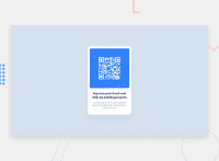
About the responsiveness, you can achieve this by using responsive properties such as max-width. You firstly need to use the entire body canvas, as right now it's set to a width of 250px, which is much too small for the body. We normally do not set any fixed widths on the body aside from 100%. Once you have the correct dimensions on the body, you can easily center your entire component using display: grid and not need to use padding and margins.
I'd rewrite the body like this
// resets here

* {
   box-sizing: border-box;
}
html, body, main, section, h1, h2, p, span {
   margin: 0;
   padding: 0;
}

// everything else

body {
   width: 100%;
   min-height: 100vh;
   display: grid;
   place-content: center;
   background-color: rgb(220, 232, 238);
   font-family: 'Poppins', sans-serif;
   text-align: center;
}
.wrapper {
   max-width: 400px;  // notice that this is not width
   padding: 1rem;
   margin: 1rem;
}
.image-wrapper {
   border-radius: 30px;
   background-color: rgb(50, 145, 240);
   padding: 3rem; // this is just a suggest value
}
img {
   display: block;
   max-width: 100%;
}
That should give you the general shape of the component. I notice also that the QR code you used is different than the one in the design, and you are using rbg() instead of hsl(), which is normally what Frontend Mentor uses. Were you able to use the files provided in the folder of the challenge? If so, you will find the style guide and also the image folder. You also would need the correct font faces; I see you have Poppins in the <head> tag, but there are no font weights (e.g., 400, 700), so be sure to add them in from Google Fonts.
I encourage you to practice this challenge again, especially in how to write out the body selector. Keep going, you're doing great 😊

