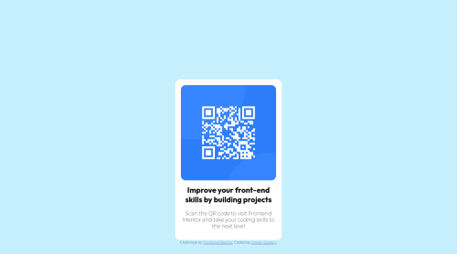
QR code component - HTML + CSS + VSCODE

Solution retrospective
The was easier because I completed the Product Card project before this. I used w3schools for reference as well my previous project. It was done a lot faster than the first one. I would love to improve this so suggestions are welcome.
Please log in to post a comment
Log in with GitHubCommunity feedback
- @madkn1311
Hello Steven,
You got the design of the card perfectly.
To center the page vertically and horizontally, you should use flex.
For that you will need to add
min-height: 100vhto the body so that it's centered vertically on all devices.Just using normal height won't make it responsive.
body{ min-height: 100vh; display: flex; flex-direction: column; justify-content: center; align-items: center; }Also in this link: <link href="style.css" text="text/css" rel="stylesheet" /> you need to add type instead of text, because the type of the document is text/css.
Type specifies the type of the document/resource.
I hope this was helpful :)
Marked as helpful

Join our Discord community
Join thousands of Frontend Mentor community members taking the challenges, sharing resources, helping each other, and chatting about all things front-end!
Join our Discord