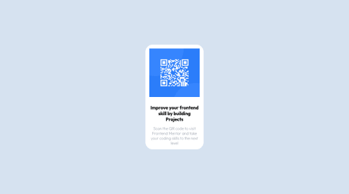
Not Found
Not Found
Not Found
Not Found
Not Found
Not Found
Not Found
Not Found
Not Found
Not Found
Not Found
Not Found
Not Found
Not Found
Not Found
Not Found
Not Found
Not Found
Not Found
Not Found

Submitted

QR code component, i used HTML and CSS and it was quite fun

Ozioma Egoleโ€ข 50

@Ozioma45

Desktop design screenshot for the QR code component coding challenge

This is a solution for...

  • HTML
  • CSS
1newbie
View challenge

Design comparison


SolutionDesign

Solution retrospective


Even though i finish the challenge am not really sure i follow the best practices and would really want feedback on the code and result

i would really appreciate correction and opinions

Community feedback

@MelvinAguilar

Posted

Hello there ๐Ÿ‘‹. Good job on completing the challenge !

I have some suggestions about your code that might interest you.

Background ๐ŸŒ†:

  • You should not recreate the background, you used the image desktop-preview.jpg to create your solution, but that image is for decoration and is a nice way to present the challenge, for example, you can use it in your github README.

    You must use the images desktop-design.jpg and mobile-design.jpg to create your solution.

HTML ๐Ÿ“„:

  • The text Improve Your Front-End Skills by Building Projects is considered a heading element (h1).

Alt text ๐Ÿ“ท:

Here are some guidelines to follow when writing alt text:

  • The alt attribute should not contain underscores or hyphens, it must be human readable and understandable.
  • The alt attribute should not contain the words "image", "photo", or "picture", because the image tag already conveys that information.
  • Alt text should provide a clear and accurate description of the image's content or purpose. In this challenge, if you scan the QR code you will be redirected to the "frontendmentor.io" website, so a better alt attribute would be QR code to frontendmentor.io
  • Advice for other challenges: Use empty alt text for decorative images: If an image is used for decorative purposes only and does not convey any important information, the alt text should be left empty.

    If you want to learn more about the alt attribute, you can read this article. ๐Ÿ“˜.

CSS ๐ŸŽจ:

  • The width: 100% property in the main tag is not necessary. The main tag is a block element and it will take the full width of the page by default. [1]
  • Use min-height: 100vh instead of height: 100vh. The height property can cause your component to be cut off on small screens, such as a mobile phone in landscape mode. [2]
  • Avoid setting a height to your component and let the content of your component determine the height, don't use heights with percentages as this can cause your text to overflow the component on mobile devices. [3]
  • Setting the image height to 200px creates that elongated shape of the image, you can remove it so that it does not distort. [4]

    main {
        /* width: 100%; */     /*  [1]   */ 
        /* height: 100vh; */   /*  [2]   */ 
        min-height: 100vh;
        /* background-image: url(images/blue.png); */  /* NOTE: This image is not necessary, its only background should be the color "light blue" (hsl(212, 45%, 89%)). */
        /* background-position: center; */
        /* background-repeat: no-repeat; */
        display: flex;
        justify-content: center;
        align-items: center;
        /* background-size: cover; */
        background-color: hsl(212, 45%, 89%);
    }
    
    .container {
        /* width: 90%; */
        /* height: 90%; */
        /* display: flex; */
        /* justify-content: center; */
        /* align-items: center; */
        /* background-color: hsl(212, 45%, 89%); */
        /* box-shadow: 2px 2px 20px rgb(0 0 255 / 40%); */
    }
    
    .inner-container {
        width: 20rem;
        /* width: 20rem; */   /* NOTE: Use max-width instead of width, this will make the container card a bit responsive on mobile and set the element's maximum width to 20rem. */
        margin: 1rem;         /* NOTE: Use this to add some space for the container card and the screen edge on mobile devices. */
        /* height: 30rem; */  /*  [3]  */  
        background-color: hsl(0, 0%, 100%);
        border-radius: 30px;
        box-shadow: 2px 2px 20px rgb(0 0 255 / 40%);
    }
    
    .img-container {
        padding: 1rem;
    
        /* NOTE:  This is not necessary, neither to center the image, nor to place it, also you can use padding to add space between the borders and the image.*/
        /* width: 100%; */
        /* border-radius: 30px; */
        /* display: flex; */
        /* justify-content: center; */
    }
    
    .img {
        width: 100%;
        /* width: 90%; */
        /* height: 200px; */      /*  [4]  */  
        /* margin: 1rem; */
        display: block;
    }
    
    @media only screen and (max-width: 800px) {
     .inner-container {
        /* width: 20rem; */
        /* height: 80%; */
     }
    
     .container {
        /* width: 100%; */
        /* height: 100vh; */
     }
    }
    

Please don't worry if your suggestions are long, they are just details. In the end, the project is well done ๐Ÿ‘. Hope you find those tips helpful! ๐Ÿ‘

Happy coding!

Marked as helpful

1

Ozioma Egoleโ€ข 50

@Ozioma45

Posted

@MelvinAguilar Thanks alot for taking your time to correct and air out your observation

1
Hassia Issahโ€ข 50,870

@Hassiai

Posted

Replace <p class="head-text"> with <h1> to fix the accessibility issues.

There is no need to style the main and .container. Give the body the background-color you gave to .container.

To center .inner-container on the page using flexbox, add min-height:100vh; display: flex; align-items: center: justify-content: center; to the body.

To center .inner-container on the page using flexbox:
body{
min-height: 100vh;
display: flex;
align-items: center;
justify-content: center;
}

Replace the height value in .inner-container with a padding value for all the sides. e.g,: padding: 15px

There is no need to give to give .text-container, h1 and p font wieght values. Give . text-container a font-size of 0.9375rem which is 15px, this will be the font-size of both p and h1.

Hope am helpful.

Well done for completing this challenge. HAPPY CODING

Marked as helpful

0

Ozioma Egoleโ€ข 50

@Ozioma45

Posted

@Hassiai thanks alot for the observations

0

Please log in to post a comment

Log in with GitHub
Discord logo

Join our Discord community

Join thousands of Frontend Mentor community members taking the challenges, sharing resources, helping each other, and chatting about all things front-end!

Join our Discord