
Solution retrospective
As this was a beginner challenge, I am happy I never got that stuck and was able to set up the basic format without any issues.
What challenges did you encounter, and how did you overcome them?My main issue, and what is usually my issue is getting the sizing and responsiveness correct. I was able to size it so that it will fit both desktop and mobile devices without issue, however I would like to make it more responsive for different screen sizes.
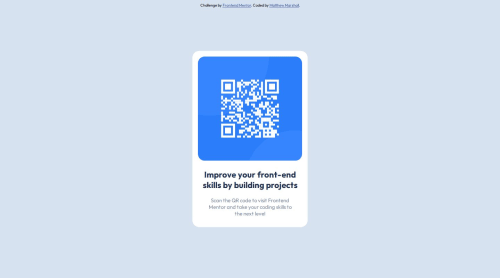
What specific areas of your project would you like help with?I would like to get better at understanding how to create responsive websites. I also would like to know what the best solution to sizing the image was. I found that setting max-width to '-webkit-fill-available' got it to fit as I wanted it to, but I do not know if this is the best way to go about it. Should it just have a set height and width?
Please log in to post a comment
Log in with GitHubCommunity feedback
- @Advyta
Hello there, Congratulations on completing this project
There are some best practices that you should consider while creating responsiveness in your website.
- Mobile-First Approach: Start your design with mobile screen in mind and then scale up for larger devices
- Use Media Queries: Media queries allow you to define different breakpoints for your website, helping you specify different CSS properties based on the size of the user’s screen
- Relative Units: Try to use relative units like ‘vh’, ‘vw’, and ‘%’ instead of fixed pixels. This ensures that elements resize components according to the screen size
- CSS Flexbox or Grid: These are modern CSS features that can be used for creating responsive layouts. They make planning website layouts easy
You can learn responsive design in detail from here W3School or Introduction To Responsive Web Design - HTML & CSS Tutorial
Now regarding sizing the image in your code
max-width: -webkit-fill-availableproperty you used is a WebKit-specific property that might not work in all browsers. You can instead usemax-width: 100%andheight: autofor your images. This makes the image responsive and scales it down if necessary, but never scales it up to be larger than its original size. You can modify your.qrclass like this:.qr { border-radius: 20px; max-width: 100%; height: auto; }Also consider using semantic HTML tags like
<main></main>,<section></section>and others that you can find in this link. The main tag should hold the main content of the page and you can divide the content into sections. The semantic HTML tags help the search engines and other user devices to determine the importance and context of web pages. The pages made with semantic elements are much easier to read and offers a better user experience. It has greater accessibility. Usingdivwhen there's a better alternative is not a good practice asdivhold no semantic value.I hope this feedback is helpful
Other than that good job!

Join our Discord community
Join thousands of Frontend Mentor community members taking the challenges, sharing resources, helping each other, and chatting about all things front-end!
Join our Discord