Submitted almost 2 years agoA solution to the QR code component challenge
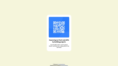
QR code component

@ebeeraheem
Solution retrospective
Help Needed
- During the process of completing this challenge, I find aligning the card to the middle to be quite difficult. Is there an easier way to accomplish this?
- I wasn't sure whether the CSS max-width would suffice to make the card responsive even on mobile devices, although I did used relative units as best I could. What suggestions would you offer to make the site more responsive?
- Were the methods I used considered best practices or are there better alternatives that I should explore?
Code
Please log in to post a comment
Log in with GitHubCommunity feedback
- @VickyAzola
Hi! Great work finishing this challenge! For your first question, there is an easier way! When there is something you want to center vertically and horizontally, you can use a display grid or flex.
- With Grid:
body { min-height: 100vh; //sets the minimum height of the body to be 100% of the screen. display: grid; place-content: center; //align content vertically and horizontally. }- With Flex
body { min-height: 100vh; display: flex; flex-direction: column; justify-content: center; align-items: center; }- For the second question, in this case, it is sufficient since the design is the same for mobile and desktop. When you need to make different designs in the future use the @media queries of CSS, here is a link for more info on that
Hope this helps!
Marked as helpful

Join our Discord community
Join thousands of Frontend Mentor community members taking the challenges, sharing resources, helping each other, and chatting about all things front-end!
Join our Discord