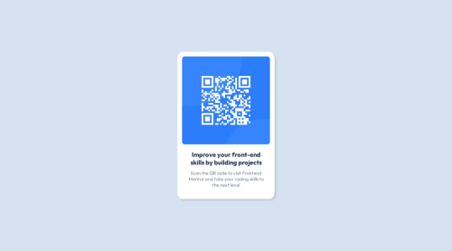
Not Found
Not Found
Not Found
Not Found
Not Found
Not Found
Not Found
Not Found
Not Found
Not Found
Not Found
Not Found
Not Found
Not Found
Not Found
Not Found
Not Found
Not Found
Not Found
Not Found

Submitted

QR code component

Alexandru736• 50

@Alexandru736

Desktop design screenshot for the QR code component coding challenge

This is a solution for...

  • HTML
  • CSS
1newbie
View challenge

Design comparison


SolutionDesign

Solution retrospective


What are you most proud of, and what would you do differently next time?

I was able to do my first HTML & CSS mini project, covering some of the basics I've learned.

What challenges did you encounter, and how did you overcome them?

What breakpoints to add to the card's responsiveness. I checked online what are the most appropriate widths for the most used devices.

What specific areas of your project would you like help with?

So far none. If there are better things I could do to improve the quality of my work, I'm ready to listen.

Community feedback

P

@Islandstone89

Posted

HTML:

  • <main> has an implicit role="main", so there is no need to declare it explicitly.

  • The alt text must also say where it leads(frontendmentor website).

  • .attribution should be a <footer>, and you should use <p> for the text inside. It needs to be moved outside of the footer, as they are 2 separate landmarks.

CSS:

  • Including a CSS Reset at the top is good practice.

  • Add around 1rem of padding on the body, so the card doesn't touch the edges on small screens.

  • Add gap: 2rem on body, to create space between the card and the footer.

  • I would use px for border-radius instead of %.

  • Remove all widths in px.

  • Add a max-width of around 20rem on the card, to prevent it from getting too wide on larger screens.

  • Since all of the text should be centered, you only need to set text-align: center on the body, and remove it elsewhere. The children will inherit the value.

  • Paragraphs have a default value of font-weight: 400, so there is no need to declare it.

  • On the image, change width to max-width.

  • As the design doesn't change, there is no need for any media queries. When you do need them, they should be in rem, not px.

Marked as helpful

1

Alexandru736• 50

@Alexandru736

Posted

@Islandstone89 Thank you so much for the feedback. May I ask why most distances(width, max-width) should be represented in rem units instead of px? I am new to CSS and I don't quite understand yet when and where should use some units. If the answer would be too long to write, I would kindly appreciate if you would provide some useful articles to read.

1

Please log in to post a comment

Log in with GitHub
Discord logo

Join our Discord community

Join thousands of Frontend Mentor community members taking the challenges, sharing resources, helping each other, and chatting about all things front-end!

Join our Discord