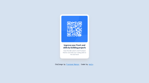
Responsive QR Code Component

Solution retrospective
Hello! I have completed the QR Code Component. I would like to have a feedback regarding my creation :)
Please log in to post a comment
Log in with GitHubCommunity feedback
- @MelvinAguilar
Hello there 👋. Good job on completing the challenge !
I have some suggestions about your code that might interest you.
HTML 📄:
- Always avoid skipping heading levels; Always start from
<h1>, followed by<h2>, and so on up to <h6> (<h1>,<h2>,...,<h6>). Swap the<h3>tag with<h2>
- The
<br>tag is not a semantic element. If a screen reader user is reading the page, they will hear "line break", which breaks the flow of the content. Instead, use CSS properties likemarginandpaddingto add vertical space between elements.
- Since this component involves scanning the QR code, the image is not a decoration, so it must have an
altattribute. Thealtattribute should explain its purpose. e.g.QR code to frontendmentor.io
CSS 🎨:
- Instead of using pixels in font-size, use relative units like
emorrem. The font-size in absolute units like pixels does not scale with the user's browser settings. This can cause accessibility issues for users who have set their browser to use a larger font size. You can read more about this here 📘.
- Setting the width of the component with a percentage or a viewport unit will behave strangely on mobile devices or large screens. You should use a max-width of
320pxor20remto make sure that the component will have a maximum width of320pxon any device, also remove thewidthproperty with a percentage value.
I hope you find it useful! 😄 Above all, the solution you submitted is great!
Happy coding!
Marked as helpful - Always avoid skipping heading levels; Always start from
- @Hassiai
replace the <h3> with <h1> to fix the accessibility issue.
There is no need to give the body a width value and margin value, the main a padding value and .container a margin value.
To center .container on the page, add min-height:100vh; display: flex; align-items: center: justify-content: center; or min-height:100vh; display: grid place-items: center to the body.
To center .container on the page using flexbox:
body{
min-height: 100vh;
display: flex;
align-items: center;
justify-content: center;
}
To center .container on the page using grid: body{ min-height: 100vh; display: grid; place-items: center; }Give h1 and p a font-size 0.9375rem which is 15px. This challenge does not require a box-shadow.
Hope am helpful.
Well done for completing this challenge. HAPPY CODING
Marked as helpful


Join our Discord community
Join thousands of Frontend Mentor community members taking the challenges, sharing resources, helping each other, and chatting about all things front-end!
Join our Discord