


Ecem Gokdogan• 9,360
@ecemgo
Posted
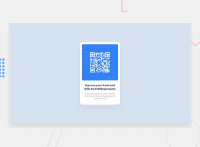
Some recommendations regarding your code that could be of interest to you.
- If you want to make the card centered both horizontally and vertically, you'd better add
min-height: 100vhto thebody
body {
  min-height: 100vh;
}
- If you use
max-width, the card will be responsive and you can increase the width a bit - You'd better add
paddingto give a gap between the content and the border of the card
.card {
  /* width: 240px; */
  /* height: 380px; */
  max-width: 300px;
  padding: 20px;
}
- In addition to that above, in order to make the card responsive and the image positioned completely on the card, you'd better add
width: 100%to the img
img {
  /* width: 220px; */
  /* margin-left:10px; */
  /* margin-top: 10px; */
  width: 100%;
  border-radius: 8px;
}
- If you give width to the text, it will prevent to be responsive
- You can update
marginandfont-sizea bit
h1 {
  /* width: 210px; */
  /* margin-left: 15px; */
  /* margin-top: 15px; */
  /* font-size: 16px; */
  margin: 20px 10px;
  font-size: 22px;
}
p {
  /* width: 210px; */
  /* margin-left: 15px; */
  /* margin-top: 10px; */
  /* font-size: 12px; */
  font-size: 16px;
  margin: 0 10px 30px;
}
- Finally, if you follow the steps above, the solution will be responsive. Additionally, you can remove
.containerto write less code.
/* .container {
    display: flex;
    position: absolute;
    top: 50%;
    left: 50%;
    transform: translate(-50%, -50%);
} */
Hope I am helpful. :)
0
