
Solution retrospective
Achieving a degree of responsiveness
What challenges did you encounter, and how did you overcome them?Making it responsive, I learnt about min-width and max-width
Please log in to post a comment
Log in with GitHubCommunity feedback
- P@Islandstone89
HTML:
-
Every webpage needs a
<main>that wraps all of the content, except for<header>andfooter>. This is vital for accessibility, as it helps screen readers identify a page's "main" content. Change.containerto a<main>. -
You don't need to wrap the image in a
<div>. -
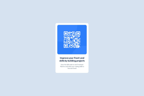
The image has meaning, so it must have proper alt text. Write something short and descriptive, without including words like "image" or "photo". Screen readers start announcing images with "image", so an alt text of "image of qr code" would be read like this: "image, image of qr code". The alt text must also say where it leads(the frontendmentor website). A good alt text would be "QR code leading to the Frontend Mentor website."
-
I would change the heading to a
<h2>- a page should only have one<h1>, reserved for the main heading. As this is a card heading, it would likely not be the main heading on a page with several components.
CSS:
-
Make a habit of including a proper CSS Reset at the top of the stylesheet.
-
I recommend adding a bit of
padding, for example16px, on thebody, to ensure the card doesn't touch the edges on small screens. -
Move
font-familytobody, and remember to specify fallback fonts:font-family: 'Outfit', system-ui, sans-serif; -
.containerdoesn't need any styles, so move those to.card. -
Remove the margin on the card. Instead, add
justify-content: centeron thebody, to center the card horizontally. -
max-widthon the card should be in rem. Around20remworks well. -
font-sizemust never be in px. This is a big accessibility issue, as it prevents the font size from scaling with the user's default setting in the browser. Use rem instead. -
On the image, add
display: block,height: autoand changewidthtomax-width: 100%- the max-width prevents it from overflowing its container. Without this, an image would overflow if its intrinsic size is wider than the container.max-width: 100%makes the image shrink to fit inside its container.
Marked as helpful -

Join our Discord community
Join thousands of Frontend Mentor community members taking the challenges, sharing resources, helping each other, and chatting about all things front-end!
Join our Discord