QR code component solution using CSS

Solution retrospective
I have complete my first challenge on frontendmentor.io and with this I am starting a new journey on this path. I had a lot of fun completing the first assignment.
As I am a beginner and have just started learning about web a couple of days back so I am sure my code can be improved. Please help me in my journey by pointing out ways in which my code can be improved or if there could be a better way to tackle a problem.
Please log in to post a comment
Log in with GitHubCommunity feedback
- @NaveenGumaste
Hello Yash Goswami ! Congo 👏 on completing this challenge
Let's look at some of your issues, shall we:
-
Why use
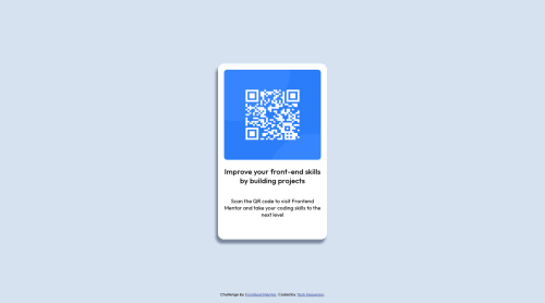
<p class="head">Improve your front-end skills by building projects</p>you should useh1here as it is title of the card -
the background shadow is very dark so make it more soft
-
Read style-guide and add the
font-styleandsizealong withweight -
Add equal padding or margin for the qr img and the texts
happy Coding😀
-
- @abhik-b
👋 Hello Yash ,Congratulations on completing your 1st challenge. Your solution is fantastic & it is very responsive 🤩👌
Some of my opinions I am sharing with you :
- give
margin: 0;to*{ }to remove unwanted margin from all elements - remove the
heightfromcard& givegap:1emto make the card look more like the design - your
box-shadowis very nice
Very Well Done 🤩 & Please keep coding such amazing solutions 🥳👍
- give


Join our Discord community
Join thousands of Frontend Mentor community members taking the challenges, sharing resources, helping each other, and chatting about all things front-end!
Join our Discord