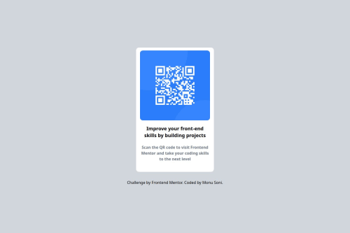
qr-code-component-solution using vite react

Please log in to post a comment
Log in with GitHubCommunity feedback
- P@Praise25
Hi, noticed you had a similar issue to mine where your card component wasn't properly centered verticaly. I fixed mine by wrapping the Card component within my App component with a
<main>element, then making that main element a flexbox and applying thealign-items: centerproperty and setting the height to 100vh. Also needed to give the body a height of 100% as well.App.tsx
import Card from "./components/Card";
import CardImage from "./components/CardImage";
import CardContent from "./components/CardContent";

import "./App.css";

function App() {
  return (
    <main className="container">
      <Card>
        <CardImage />
        <CardContent />
      </Card>
    </main>
  );
}

export default App;
App.css
body {
  margin: 0;
  background-color: var(--slate-300);
  height: 100%;
}

.container {
  display: flex;
  align-items: center;
  height: 100vh;
}
Also your font colors are a bit off. You can get the right font colors from the design system section of the figma design file that was provided. As for the font, it's named "Outfit". You can find it here on google fonts, and then import it directly into your css file. Then you can set the specific font variants using the
font-weightproperty. The google fonts page will show you what font-weight corresponds to which variant, just scroll down a bit under the "Specimen" section. You'll see it under "Styles", e.g "Thin 100", "ExtraLight 200", "Light 300" and so on. I'll add a code snippet for reference.CardContent.module.css
@import url("https://fonts.googleapis.com/css2?family=Outfit:wght@100..900&display=swap");

.sub-heading {
  text-align: center;
  font-family: "Outfit", sans-serif;
  font-weight: 700;
  font-size: calc(22rem / 16);
  line-height: 120%;
  letter-spacing: 0;
  color: var(--slate-900);
  margin-top: calc(10rem / 16);
  margin-bottom: calc(16rem / 16);
}

.description {
  text-align: center;
  font-family: "Outfit", sans-serif;
  font-weight: 400;
  font-size: calc(15rem / 16);
  line-height: 140%;
  letter-spacing: 0.2px;
  color: var(--slate-500);
  margin-top: 0;
  margin-bottom: calc(40rem / 16);
}
Finally, as much as I understand the desire to throw in a little tweak here and there (referring to the text under your card), I believe for situations like a frontend development task, it's important to stick to the design exactly as presented, to avoid shooting yourself in the foot.
P.S: I felt this one was obvious but I figured I might as well call it out for completeness sake, your background color isn't also exactly right. The right one is also located in the figma design file
Happy Coding!!!
Join our Discord community
Join thousands of Frontend Mentor community members taking the challenges, sharing resources, helping each other, and chatting about all things front-end!
Join our Discord