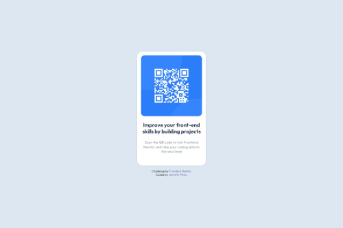
QR Code Component using CSS Custom Properties and Flexbox

Solution retrospective
I am proud of how relatively clean and organized my code turned out being, especially with the use of semantic HTML and CSS variables.
Next time, I will try to be more accurate and efficient when it comes to padding/margins and grid layout.
What challenges did you encounter, and how did you overcome them?My biggest challenge was getting the margin and padding to be as accurate to the design given as possible. I had to do a lot of testing in order to get something close.
What specific areas of your project would you like help with?I would like feedback for any improvements when it comes to margin/padding, naming conventions, and general organization.
Please log in to post a comment
Log in with GitHubCommunity feedback
- @vishu-verse
I think you did pretty good , just checked your github repo and code its fine. you can also check my submission https://vishu-verse.github.io/qr-code/ . I think margin and padding can be solved by lil research about sizing of different devices i.e. mobile , tablet , desktop ,etc. Naming convention should be like if I am reading your code I can understand with the class name that what it must be .
Join our Discord community
Join thousands of Frontend Mentor community members taking the challenges, sharing resources, helping each other, and chatting about all things front-end!
Join our Discord