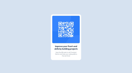
QR code component using CSS Grid

Solution retrospective
I'm proud that I just sat down and built the thing and didn't get bogged down in tutorials or anything. I used Google to find W3Schools, MDN, and blog articles to find what I needed to get it done.
Next time I'd like to start with mobile first and work from there. Also I would like to use CSS variables so I can get used to using them and make it easier to call font colors and families.
What challenges did you encounter, and how did you overcome them?- Making the card and then trying to get the spacing right between the border and the image. Played around with margin and padding with some unexpected results, but I played around with it until it looked right.
- Centering the card vertically and horizontally. I chose CSS Grid to do this because it was only three lines of CSS. Wanted something simple to accomplish a simple task. I had trouble getting Flexbox to work for this. I need to learn more about Flexbox in future projects.
- The size of the card was smaller than the design image in the mobile view so I had to use a media query at the bottom of the CSS file to make the mobile version look right. Next time I'll start with mobile and work from there.
Mainly how I can structure the code so it looks like production code. What best practices am I not aware of that will help make my code look more professional and easier to read.
Please log in to post a comment
Log in with GitHubCommunity feedback
- P@Islandstone89
Hi Levi, here is some feedback. Hope it helps!
HTML:
-
The alt text must also say where it leads(frontendmentor.io).
-
The text in
.attributionare paragraphs, so use the<p>tag.
CSS:
-
It's good practice to include a CSS Reset at the top.
-
Move
background-colortobody. -
Add around
1remofpaddingon thebody, so the card doesn't touch the edges on small screens. -
I would move the properties on
maintobody. Remove thewidth- block elements are 100% wide by default. -
align-items: centerdoesn't do anything unless you declaredisplay: flex. -
If you wanted to use Flexbox to center the card, you could use the following on the
body:
display: flex; flex-direction: column; justify-content: center; align-items: center; min-height: 100svh;-
Remove the width and height on the card. The web is different from the printed medium - we want our components to be responsive, meaning they can adapt to different screen sizes.
-
Add a
max-widthof around20remon the card, to prevent it from getting too wide on larger screens. -
font-sizemust never be in px. This is a big accessibility issue, as it prevents the font size from scaling with the user's default setting in the browser. Use rem instead. -
Since all of the text should be centered, you only need to set
text-align: centeron the body, and remove it elsewhere. The children will inherit the value. Do the same withfont-family. -
You can give
padding-leftandpadding-rightthe same value by usingpadding-inline: 1em, for example. -
On the image, add
display: blockand changewidthtomax-width: 100%- the max-width prevents it from overflowing its container.
Marked as helpful -

Join our Discord community
Join thousands of Frontend Mentor community members taking the challenges, sharing resources, helping each other, and chatting about all things front-end!
Join our Discord