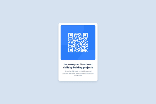
QR code component using CSS media query

Solution retrospective
I'm most proud of successfully completing the challenge using only HTML and CSS, and that my design closely matched the given design files for both desktop and mobile views. I also learned how to make the layout responsive using media queries.
What challenges did you encounter, and how did you overcome them?One challenge I faced was making the project responsive for smaller screen sizes like 375px. At first, the layout looked broken on mobile devices. I overcame this by using a media query to adjust the container width and padding for small screens.
I also had some trouble with the alignment and spacing of the text and image inside the card. I fixed this by using text-align: center and adjusting margins and padding based on the design preview.
What specific areas of your project would you like help with?I would appreciate feedback on how I structured my CSS especially on whether I followed best practices for responsiveness.
I’m also curious if there's a better way to handle the responsive design for screen sizes around 375px and up.
Please log in to post a comment
Log in with GitHubCommunity feedback
- @stephany247
Hi Olisa,
You did a great job on this project — well done! 🎉 Your layout is clean, the design looks visually appealing, and your code is structured in a way that shows you understand the basics of HTML and CSS. I'm proud of the effort you put into this.
Here are a few specific things I really liked:
- ✅ Clean layout and visual styling – The use of spacing, border-radius, and colors made the component pleasant to look at.
- ✅ Good use of Flexbox to center your content both vertically and horizontally.
- ✅ Responsive design – It's great that you added a media query and thought about different screen sizes.
Now, here are a few areas you can improve on:
-
Accessibility: The image is missing a descriptive
altattribute. This is important for users who rely on screen readers, and also helps with SEO. For example, instead of:<img src="..." alt="">You could write:
<img src="..." alt="QR code linking to Frontend Mentor website"> -
Responsive Design: Your media query works, but the range is quite wide. As you grow, consider using more specific breakpoints based on actual device sizes (e.g., 768px for tablets, 1024px for small laptops).
-
Code Maintainability: Try to comment your code more and use clearer class names. This makes it easier to maintain and collaborate on.
-
Interaction & Feedback (Optional): You could take the UI a step further by adding small interaction styles like
hovereffects or subtle animations.
🌟 Final Thoughts:
This was a strong submission. You’ve shown a solid understanding of structure and styling. With just a bit more focus on accessibility and best practices, you’ll be building even more professional projects in no time. Keep up the great work, and keep practicing!
If you have any questions about the feedback or want to try improving the project based on it, feel free to ask.
👏👏👏
Marked as helpful - @RASHAD09
(Good Practices)


Join our Discord community
Join thousands of Frontend Mentor community members taking the challenges, sharing resources, helping each other, and chatting about all things front-end!
Join our Discord