


Matin Zafari• 70
@MachineCode0101
Posted
The design can be responsive as well. By that I mean when we change the screen size to a smaller one or a mobile device, the current design "overflows" when collapsed, For example instead of using "px" we can use "rem" or even better "100%" and so on.
1
Daniel Alyoshin• 20
@danielalyoshin
Posted
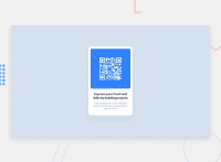
I have reworked my solution to be both responsive and use proper semantic HTML with proper landmarks. @MachineCode0101
1
Matin Zafari• 70
@MachineCode0101
Posted
@danielalyoshin I see! great work Daniel, keep challenging yourself and ask me or anyone else here if you need more help!
1
Matin Zafari• 70
@MachineCode0101
Posted
@danielalyoshin Also need to add that your solution looks cleaner than mine!!
1
