Skip to content
  • Unlock Pro
  • Log in with GitHub
Solution
Submitted almost 3 years ago

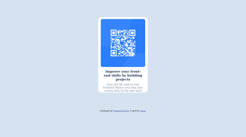
Qr code component using html and css

cube-css
Akinrinlola Henry•310
@Procodx
A solution to the QR code component challenge
View live sitePreview (opens in new tab)View codeCode (opens in new tab)
Code
Select a file

Please log in to post a comment

Log in with GitHub

Community feedback

  • Vincent Daniel•410
    @davinceey
    Posted almost 3 years ago

    Hello Akinrinlola olamide. Congratulations on your first project! Just some little tips for improvement:

    1. You could make use of the display: flex to centralize your solution. You could make use of this code:
    body{
    display: flex;
    justify-content: center;
    align-items: center;
    }
    
    1. You could wrap all your content with the <main> tag and then make use if the h1 tag as a level-one heading. It would be perfect if it replaces the h3 tag used in your code and it would help in improving Accessibility.

    2. You could also make use of relative units like the em and rem units for your font-sizes, padding, margins and widths. This would help to improve your site's responsiveness.

    Hope this helps you. Happy Coding!👊

    Marked as helpful
  • Lucas 👾•104,160
    @correlucas
    Posted almost 3 years ago

    👾Hi @Procodx, congratulations for your first solution!👋 Welcome to the Frontend Mentor Coding Community!

    Great solution and great start! By what I saw you’re on the right track. I’ve few suggestions to you that you can consider to add to your code:

    1.Use <main> instead of <div> to wrap the card container. This way you show that this is the main block of content and also replace the div with a semantic tag.

    2.Replace the <h3> containing the main title with <h1> note that this title is the main heading for this page and every page needs one h1 to show which is the most important heading. Use the sequence h1 h2 h3 h4 h5 to show the hierarchy of your titles in level of importance, never jump a level.

    3.Use units as rem or em instead of px to improve your performance by resizing fonts between different screens and devices. These units are better to make your website more accessible. REM does not just apply to font size, but to all sizes as well.

    4.Your component is okay but it's missing the vertical alignment. The best way to do it is by using flexbox. First step is to add min-height: 100vh to make the body height size becomes 100% of the screen height, this way you make sure that whatever the situation the child element (the container) align the body and then use the flex properties for alignment with display: flex / align-items: center; / justify-content: center;

    body {
        MIN-HEIGHT: 100VH;
        background-color: hsl(212, 45%, 89%);
        text-align: center;
        display: flex;
        flex-direction: column;
        align-items: center;
        justify-content: center;
    }
    

    ✌️ I hope this helps you and happy coding!

    Marked as helpful

Join our Discord community

Join thousands of Frontend Mentor community members taking the challenges, sharing resources, helping each other, and chatting about all things front-end!

Join our Discord
Frontend Mentor logo

Stay up to datewith new challenges, featured solutions, selected articles, and our latest news

Frontend Mentor

  • Unlock Pro
  • Contact us
  • FAQs
  • Become a partner

Explore

  • Learning paths
  • Challenges
  • Solutions
  • Articles

Community

  • Discord
  • Guidelines

For companies

  • Hire developers
  • Train developers
© Frontend Mentor 2019 - 2025
  • Terms
  • Cookie Policy
  • Privacy Policy
  • License

Oops! 😬

You need to be logged in before you can do that.

Log in with GitHub

Oops! 😬

You need to be logged in before you can do that.

Log in with GitHub

How does the accessibility report work?

When a solution is submitted, we use axe-core to run an automated audit of your code.

This picks out common accessibility issues like not using semantic HTML and not having proper heading hierarchies, among others.

This automated audit is fairly surface level, so we encourage to you review the project and code in more detail with accessibility best practices in mind.

How does the CSS report work?

When a solution is submitted, we use stylelint to run an automated check on the CSS code.

We've added some of our own linting rules based on recommended best practices. These rules are prefixed with frontend-mentor/ which you'll see at the top of each issue in the report.

The report will audit all CSS, SCSS and Less files in your repository.

How does the HTML validation report work?

When a solution is submitted, we use html-validate to run an automated check on the HTML code.

The report picks out common HTML issues such as not using headings within section elements and incorrect nesting of elements, among others.

Note that the report can pick up “invalid” attributes, which some frameworks automatically add to the HTML. These attributes are crucial for how the frameworks function, although they’re technically not valid HTML. As such, some projects can show up with many HTML validation errors, which are benign and are a necessary part of the framework.

How does the JavaScript validation report work?

When a solution is submitted, we use eslint to run an automated check on the JavaScript code.

The report picks out common JavaScript issues such as not using semicolons and using var instead of let or const, among others.

The report will audit all JS and JSX files in your repository. We currently do not support Typescript or other frontend frameworks.

Oops! 😬

You need to be logged in before you can do that.

Log in with GitHub

Oops! 😬

You need to be logged in before you can do that.

Log in with GitHub