Not Found
Not Found
Not Found
Not Found
Not Found
Not Found
Not Found
Not Found
Not Found
Not Found
Not Found
Not Found
Not Found
Not Found
Not Found
Not Found
Not Found
Not Found
Not Found
Not Found

Submitted

QR code component using html and css

@JVincee
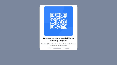
Desktop design screenshot for the QR code component coding challenge

This is a solution for...

  • HTML
  • CSS
1newbie
View challenge

Design comparison


SolutionDesign

Solution retrospective


I am using HTML and CSS, and I am having a hard time making it responsive. I am bad at making responsive layouts.

  • What can you suggest for me to make a responsive site?

Community feedback

P
Jeuri Morel• 1,405

@JeuriMorel

Posted

I personally like using clamp a lot as a way of handling responsive sizes. Don't know what widths the design calls for, but as an example I would give the card the following: width: clamp(320px, 20vw, 375px);. If you never used clamp before, the first value is the min-width, the third is the max-width, and the middle value is the preferred value. You can read more about it here. In my example it will calculate 20% of the screen width and assign that to the card, without going outside of the 320px and 375px range.

Try not using margins as a way of centering items. You've already setup the body as a flexbox, but the reason the card isn't perfectly centered vertically is that the body isn't taking up the full height. To fix this give the body height: 100vh;

Marked as helpful

1

@JVincee

Posted

@JeuriMorel Thank you for suggesting it. I just used clamp, and it works pretty well, making it responsive. Also, I'm having a hard time fixing how to center the items, so I used margins to center it, so thank you for correcting me.

0
Brendan• 1,120

@OneManBanned

Posted

Hi John

  • You should change the <h2> to a <h1>. All pages need a <h1> heading element. The usage notes section on the mdn headings page explains why. Here is the link

  • I would also change the .container div into a <main> element. The <main> HTML element represents the dominant content of the <body> of a document.

  • If you remove all of your media queries and change your .container div width: 90% and max-width: 20rem your site will be responsive. What this is does is let the container grow to a maximum size of 20 rems and if the containing block is less than 20 rems then if fills 90% of the space of the containing block. The containing block here is the <body> element.

  • I would also suggest putting your Css in a separate file. It helps keep everything nice and tidy. Here a tutorial on how to do it if you're unsure

Good work.

Marked as helpful

1

@JVincee

Posted

@OneManBanned Thank you. I did apply some of your suggestions, and it works very well with my code. Also, thank you for suggesting to separate the CSS from the HTML file it makes my code clean.

0

Please log in to post a comment

Log in with GitHub
Discord logo

Join our Discord community

Join thousands of Frontend Mentor community members taking the challenges, sharing resources, helping each other, and chatting about all things front-end!

Join our Discord