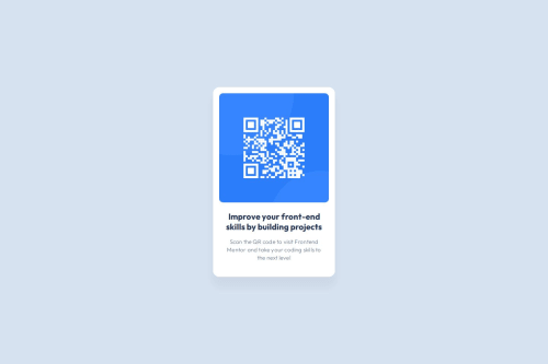
QR Code Component using HTML and CSS

Solution retrospective
I was proud that I was able to code the QR code component in 30 minutes and make the design identical
What challenges did you encounter, and how did you overcome them?I had to think a little until I realized that I needed to limit the sizes of the elements with max-width so as not to lose the appearance of the prototype
Please log in to post a comment
Log in with GitHubCommunity feedback
- P@Islandstone89
Hi Gabriel, good job.
Here are some suggestions :)
HTML:
-
<main>holds all of the main content on a page. As a card would likely not be the only component on a page, I would wrap the card content in a<div class="card">inside of<main> -
The alt text must also say where it leads(the frontendmentor website). Write something short and descriptive, without including words like "image" or "photo". Screen readers start announcing images with "image", so an alt text of "image of qr code" would be read like this: "image, image of qr code". A good alt text would be "QR code leading to the Frontend Mentor website."
-
I would change the heading to a
<h2>- a page should only have one<h1>, reserved for the main heading. As this is a card heading, it would likely not be the main heading on a page with several components. -
It's recommended to use classes instead of IDs. This article explains when to use the
idattribute.
CSS:
-
Including a CSS Reset at the top is good practice.
-
Move
font-familytobody, it's not common to set any styles onhtml. -
I recommend adding
1remofpaddingon thebody, to ensure the card doesn't touch the edges on small screens. -
Using
#containeras a selector increases specificity, so I would usebodyas the selector instead. On thebody, changeheighttomin-height: 100svh- this way, the content will not get cut off if it grows beneath the viewport. -
On the card, remove
height: auto, it is not needed. Change themax-widthto20rem, which equals320px. -
font-sizemust never be in px. This is a big accessibility issue, as it prevents the font size from scaling with the user's default setting in the browser. Use rem instead. -
letter-spacingmust also not be inpx. You can useem, where1emequals the element's font size. -
On the image, add
display: blockand changewidthtomax-width: 100%- the max-width prevents it from overflowing its container. Without this, an image would overflow if its intrinsic size is wider than the container.max-width: 100%makes the image shrink to fit inside its container. Removeheight: 100%, it is not needed. You can setheight: auto, though. -
Remove
max-widthon the image and the text.
Marked as helpful -
- @jonathanudeh
It looks really nice and very identical. kudos. Though it looks like in your css you styled your elements in a disorganized manner. I recently learnt that it is good practice to style from top to bottom. I hope this feedback finds you well.


Join our Discord community
Join thousands of Frontend Mentor community members taking the challenges, sharing resources, helping each other, and chatting about all things front-end!
Join our Discord