Submitted about 1 year agoA solution to the QR code component challenge
QR code component using margin auto and padding

P
@mrcordova
Solution retrospective
What are you most proud of, and what would you do differently next time?
I like how the card itself turned out. All the elements lined up nicely. I would probably work on centering the card better.
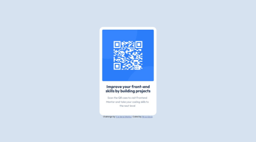
What challenges did you encounter, and how did you overcome them?I was having trouble rounding the corners of the image because I originally put the image in a `````` element and that was not showing the rounded corners. To fix this issue I removed the div element.
How should I go about centering elements vertically so it's always centered.
Code
Please log in to post a comment
Log in with GitHubCommunity feedback
- @grace-snow
This is the time to focus in on learning html well.
- All content should be contained in landmarks. The card should be in a main and the attribution in a footer.
- The card could be a section if you want but there shouldn't be a section within it. (The heading and paragraph actually don't need wrapping in any extra element if you want).
- Make sure the alt text on the image is descriptive enough. This needs to say what the image is (QR code) and where it goes to (to FrontendMentor.io).
- I recommend you include the css reset at the start of your styles. There's no need to make an extra server call for a whole other file.
- To center the component on the screen make the wrapping element (eg body in this challenge) a flex column, min height 100svh and use flex properties to center its children.
- The card must not have a height. Never limit the height of elements that contain text. This will currently break for users with a different text size or if authors included more content in a card. Let the browser do it's job and decide what height is needed based on the content inside the card.
- The component should not have a width either (unless 100%). It should have a max width in rem. This allows the card to shrink narrower when viewed on a small screen and using rem means it will scale correctly even if site visitors have a larger default text size.
- Font size must never be in px
- Using percentage for padding takes away all.of your control of the layout. Use px or rem.
- The margins left and right on the paragraph seem strange... I can't think why they are there or have different values. It would be more usual to have max width in ch units and margin-inline auto for centered text if you wanted to limit its width in some way... But Im not sure what the intention was there.
Marked as helpful - @adabo4
Nice design with clean code!
- @Ogo1A
yes it does.i want to learn and practice more all the time.improve on semantic tags


Join our Discord community
Join thousands of Frontend Mentor community members taking the challenges, sharing resources, helping each other, and chatting about all things front-end!
Join our Discord
