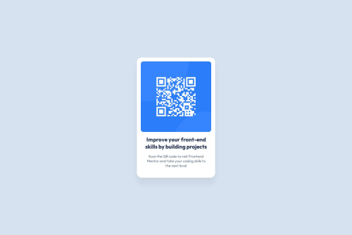
QR Code Component using Semantic HTML & Flexbox | Pixel-perfect Figma

Solution retrospective
I'm most proud of how closely I matched the original Figma design using clean and semantic HTML along with custom CSS. I took time to ensure the layout was fully centered, responsive, and visually consistent across devices — without relying on any external frameworks.
I also paid attention to accessibility by using proper alt text and semantic tags like <main>, <article>, and <h1>, which I now understand better after doing this challenge.
If I were to do it again, I’d refactor the structure slightly — maybe use a <figure> and <figcaption> for better semantics. I’d also try to build it using Tailwind CSS or even React just to practice how I can rebuild simple components in different frameworks for learning.
One of the main challenges I faced was getting the layout to center perfectly both vertically and horizontally on all screen sizes. At first, the container was stretching or misaligning slightly on smaller screens, but I solved it by using flexbox on the <main> element with justify-content: center and align-items: center, along with height: 100vh.
Another challenge was making sure the spacing and dimensions exactly matched the Figma design. I had to carefully inspect padding, border-radius, and shadow values to match them pixel-perfect. Understanding the difference between box-shadow and filter: drop-shadow() also helped me apply the right shadow behavior.
Overall, these issues helped me better understand how CSS layout and design precision work together, and I feel more confident debugging layout problems now.
What specific areas of your project would you like help with?I'd appreciate feedback on whether my use of semantic HTML can be improved further — for example, using <figure> and <figcaption> instead of a <section> for the image and text grouping?
I'd also like advice on CSS best practices for small, component-based layouts like this. Are there ways to make my CSS more scalable or maintainable if this were part of a larger project?
Lastly, any tips on how to better match Figma designs with precise spacing, shadows, and responsive behavior would be really helpful. I want to keep improving my eye for detail and layout accuracy.
Please log in to post a comment
Log in with GitHubCommunity feedback
- @Mharvel13
Your work on this component-based layout shows a solid foundation, and I appreciate the clarity of your structure.
Regarding your question on CSS best practices, I think you're on the right track, but there are ways to push it further for scalability and maintainability.
Using consistent naming conventions like BEM or adopting a CSS-in-JS solution can really help keep styles modular and easier to manage in larger projects.
Also, defining variables for repeated values—like colors, spacing, and shadows—will make your styles more reusable and less prone to errors when scaling.
On the design side, matching Figma layouts more precisely often comes down to developing a stronger sensitivity to spacing and alignment. It might help to inspect Figma designs with greater granularity—zooming in, checking pixel values, and using tools that overlay designs onto your live layout for comparison.
Try building with fluid units like rem, em, or percentages, and make use of modern layout tools like flexbox and grid with media queries.
Marked as helpful - @UzomaN-Hub
Nice work. i did mine too. However i only used HTML and CSS. i am also good at Reactjs. Maybe i will use it next


Join our Discord community
Join thousands of Frontend Mentor community members taking the challenges, sharing resources, helping each other, and chatting about all things front-end!
Join our Discord