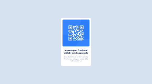
QR Code Component using simple CSS

Solution retrospective
Well, this is my first project and I had some difficulties during it but I think it is because I tought too much about simple things and made them way harder or complex than they should be, overall I think it looks decent. If you have any tips or feedback about the project I would love to hear them so that I can continue practicing and doing other projects. 👍
Please log in to post a comment
Log in with GitHubCommunity feedback
- @PhoenixDev22
Hi Isaac Vono,
Congratulation on completing this frontend mentor challenge. Your solution looks great. I have some suggestions regarding your solution:
- In my opinion, the image is an important content. The alternate text is needed on this image. The alternate text should indicate where the Qr code navigate the user : like
QR code to frontend mentornot describes the image. The alternate text should not be hyphenated, it should be human readable.
- Add
min-height: 100vhto the body that let the body grows taller if the content outgrows the visible page instead.
-
width: 256px;an explicit width is not a good way to have responsive layout . Consider usingmax-widthto the card inrem. -
Adding max-width on the body tag to prevent layout from stretching. If you try to zoom out on your browser , you'll see that the layout stretches, adding max-width will prevent that. Personally, I don’t restrict the width or height of the body element. If I need to restrict the width I use a container div with a max-width on it.
- Remember a css reset on every project. That will do things like set the images to display block and make all browsers display elements the same.
Overall, Excellent work! Hopefully this feedback helps.
Marked as helpful - In my opinion, the image is an important content. The alternate text is needed on this image. The alternate text should indicate where the Qr code navigate the user : like
- @hmadamk
first of all you should never use fixed height unless really neccessary, so to center your main card you should use
body{ min-height:100vh }and you don't need to add the width on the body secondly you should import the font from google fonts the link is on the readme you check the rquired weights and add the generated link on the top of your html code; lastly to control your text width you should use the ch unit wich is the width of the number zero like thatp{ width:32ch }Marked as helpful - @satzzzzz07
Hey there, Great work on your first solution! Design looks good. There are few suggestions:
-
Try to use the fonts mentioned in the style-guide file. You can import the fonts from google fonts(https://fonts.google.com/). Its a simple process, choose the font, size and then import them into your css or html files. You can use the font style using
font-familycss property. -
Centering the Element - For Centering the element in the page you can wrap the element in a div. and use flexbox more about flexbox.
Aside these, excellent work again and happy coding :) 👍
Marked as helpful -
- @DavidMorgade
Hey Isaac, congrats on finishing the challenge and welcome to the community, you did a pretty good job for a first challenge!
It seems that you had some trouble centering your component, I would recommend you to remove the fixed width and height from your body cause that is causing some strange behaviour on your layout.
Apart from that, since you already have
display: gridon yourbody, you just need to use the propertyplace-content: center(this will center your item inside the grid to the center), and also set the body height to the full screen withheight: 100vh;.With just this 2 properties and removing the fixed width and height, you should get your component on the middle of the screen!
Hope my feedback helps you, if you have any questions, don't hesitate to ask!
Marked as helpful
Join our Discord community
Join thousands of Frontend Mentor community members taking the challenges, sharing resources, helping each other, and chatting about all things front-end!
Join our Discord