QR Code Component with Flexbox

Solution retrospective
Hi, friends!
I'm very new to HTML and CSS but decided to try out Frontend Mentor. I've been following a Udemy web development course, and this is the first time I've really strayed away from it. I definitely felt the gaps in my knowledge. Until I did this project, I didn't really understand nesting in CSS. I think this has given me a better idea. Also, centering items within the body of the page is particularly hard for me. It took a lot of Googling to figure it out. Any pointers on how to remember what to do?
I'm super eager to learn more, so please let me know if you have any feedback at all!
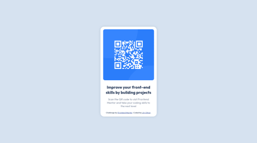
P.S., I wasn't sure if that was a drop shadow or compression artifacts around the card... so I added a little shadow.
Please log in to post a comment
Log in with GitHubCommunity feedback
- @elaineleung
Hi Lily, first off, welcome to Frontend Mentor, and congrats on completing your very first challenge! It's a huge step when you go from tutorials to actually writing your own code, and I must say that for your first challenge, you've done an excellent job!
About your question on centering items, it kind of depends on how you want things to look. Some people want their attribution as a footer pushed all the way to the end of the page, and some people might want it close to their component, which might be somewhere in the center. In your solution, you had your attribution within the component. Each of these cases could have slight variations in how the CSS is written, but regardless what the case is, the key thing that most people tend to forget is the height, which is very crucial because the browser needs to know how much space there is so that it knows where to place the component with even spacing around it. Even when people do remember to add the height, the mistake that most of them make is that they they use
height: 100%orheight: 100vhinstead ofmin-height: 100vh.In any case, for the most basic kind of centering where you want everything in the center, here's what you can do:
// centering everything in the middle using flexbox:

body {
   min-height: 100vh;
   display: flex;
   flex-direction: column; // this is needed if you have more than one child in the body selector
   align-items: center;
   justify-content: center;
}

// centering everything in the middle using grid:

body {
   min-height: 100vh;
   display: grid;
   place-content: center;
}
I encourage you to play around with both flexbox and grid so that you understand how they work because I also struggled a lot in the beginning with how to use them for centering things, especially when there are other components involved, like a footer and header.
Anyway, aside from comments on centering, one suggestion I have for your solution is to add a 1rem margin around it so that for smaller browser widths, the sides of the component won't be touching the browser. I really think you did a great job on the whole, and the real challenge will come when you need to work with responsive design (as in building a mobile view and desktop view), but no worries, I think you'll be learning lots when you put your skills to the test!
Marked as helpful - @denielden
Hi Lily, congratulations on completing the challenge, great job! 😁
Some little tips for optimizing your code:
- add
maintag and wrap the card for improve the Accessibility - also you can use
articletag instead of a simpledivto the container card for improve the Accessibility - remove all
marginfromcontainerclass because with flex they are superfluous - use
justify-content: centera flexbox property to the body to center the card horizontally - instead of using
pxuse relative units of measurement likerem-> read here
Hope this help! Happy coding 😉
Marked as helpful - add
- @correlucas
👾Hi @lily-oliver, congratulations for your first solution!👋 Welcome to the Frontend Mentor Coding Community!
Great solution and great start! By what I saw you’re on the right track. I’ve few suggestions to you that you can consider to add to your code.Something I've noticed in your code is that in many occasions you've added some
<div>to wrap contents that don't really need to be inside of a div block. Note that for this challenge all you need is a single block to hold all the content, can be<div>or<main>if you want to use a semantic tag to wrap the content, the cleanest structure for this challenge is made by a block of content with div/main and all the content inside of it (img, h1 and p) without need of any other div or something. See the structure below:<body> <main> <img src="./images/image-qr-code.png" alt="Qr Code Image" > <h1>Improve your front-end skills by building projects</h1> <p>Scan the QR code to visit Frontend Mentor and take your coding skills to the next level</p> </main> </body>✌️ I hope this helps you and happy coding!
Marked as helpful


Join our Discord community
Join thousands of Frontend Mentor community members taking the challenges, sharing resources, helping each other, and chatting about all things front-end!
Join our Discord