


Ecem Gokdogan• 9,360
@ecemgo
Posted
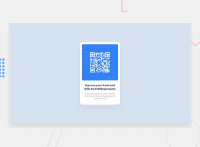
Some recommendations regarding your code that could be of interest to you.
If you want that this solution is responsive, I recommend some techniques without using media query for this solution but it's up to you whether you use it or not. Also, I recommend you try to avoid repetition in your code.
HTML
- If you want to use the recommended font-family for this project, you can add the following between the
<head>tags in HTML file:
<link rel="preconnect" href="https://fonts.googleapis.com">
<link rel="preconnect" href="https://fonts.gstatic.com" crossorigin>
<link href="https://fonts.googleapis.com/css2?family=Outfit:wght@400;700&display=swap" rel="stylesheet">
CSS
- After adding them to the HTML, you can add this font-family to the
body - If you want to make the card centered both horizontally and vertically, you'd better add flexbox and
min-height: 100vhto thebody
 body {
    background-color:hsl(212, 45%, 89%);
    font-family: 'Outfit', sans-serif;
    display: flex;
    align-items: center;
    justify-content: center;
    height:100vh;
}
- When you use flexbox in the
body, you don't need to usemarginin the.qrcardto center the card - If you use
max-width, the card will be responsive - You'd better give
paddingto give a gap between the content and the border of the card
.qrcard {
  /* padding-top: 15px; */
  padding: 15px;
  /* margin-left: auto; */
  /* margin-right: auto; */
  max-width: 300px;
}
- In addition to that above, in order to make the card responsive and the image positioned completely on the card, you'd better add
max-width: 100%to the img
img {
  /* display: flex; */
  /* margin-left: auto; */
  /* margin-right: auto; */
  /* max-width: 80%; */
  max-width: 100%;
}
- You can update
paddingof text in this way:
.textcontainer p {
  /* justify-content: center; */
  padding: 0 0 20px 0;
}
- Finally, if you follow the steps above, the solution will be responsive. You don't need to use media queries and these styles for this solution so you can remove them
/* main {
      height: 200px;
      width: 400px;
} */

/* .textcontainer {
      font-family: 'Outfit', sans-serif;
      padding: 50px 50px;
} */

/* .attribution {
      padding-top: 50px;
      margin-bottom: 50px;
} */
Hope I am helpful. :)
Marked as helpful
1
@punyagilang
Posted
@ecemgo Thank you very much, it's very helpful for me
1

