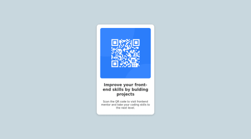
QR code components using semantic html and css styling

Solution retrospective
All feedback is welcome especially on the layout and mobile responsiveness work
Please log in to post a comment
Log in with GitHubCommunity feedback
- @imadvv
Greeting Ngbe Gloria James!! Congratulations for completing your challenge!, 👏👏👏 well done.
you did great work on this one, You've done a really good work in your first solution!, and for you question, I saw that you're using
margin: 100px auto;on card to center it on the middle of the page, which work's, however they're an alternative ways to do so, you can use either grid or flex to have a full control over the layout, and you can easily manipulate on different screen sizes.for example using grid, you can start using the body as a reference to control the layout, you start by give it a
min-height:100vhto fill the browser screen size, and display it as a grid system,display: grid;andplace-content: center;to center content perfectly on the middle of the page no matter what, from there you can safely removemargin: 100px auto;from the card,body { min-height: 100vh; display: grid; place-content: center; } .card { /* margin: 100px auto; */ }if you apply this changes, you will notice that they're no different, but if you open the DevTools, and go to the body, you will see a grid system, that you can apply different proprieties to it, and you can easily control the layout on more robust way on different screen sizes.
useful resource:
- https://web.dev/learn/css/grid/
- https://css-tricks.com/a-complete-guide-to-css-media-queries/
- https://developer.mozilla.org/en-US/docs/Learn/CSS/CSS_layout/Grids
Hope this help!
overall you did Great work matching the design, Happy Codding, and Keep up the Good Work
Marked as helpful - @elaineleung
Hi Ngbe Gloria, welcome to Frontend Mentor, and well done in completing your first challenge! You did a number of things well here, such as not setting a fixed pixel width on the image, and also in making the solution close to the design. You just need to add the Google Font in the style guide; instead of pasting the link in the style guide, you'll have to visit the link and select the font faces you need (as in the font weights), then copy the link provided and paste it back into the
headtag.About your question, I just got two suggestions here:
-
I see you using margins to making the component centered; what you can try instead is to add this to the body selector:
body { display: grid; place-content: center; min-height: 100vh; } -
To make the card more responsive, change
width:300pxtomax-width: 350pxon thecontainerand change the margins tomargin: 1remjust so there's some space around the card on smaller screen sizes. You can experiment with the max width value to see how close you can get to make it match the design.
Try resizing the browser and the card should be responsive!
Marked as helpful -


Join our Discord community
Join thousands of Frontend Mentor community members taking the challenges, sharing resources, helping each other, and chatting about all things front-end!
Join our Discord