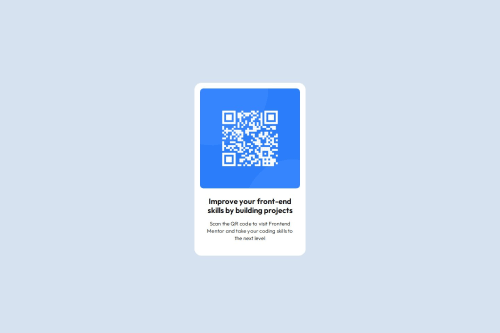
Submitted 10 months agoA solution to the QR code component challenge
qr code design using basic css

P
@Fable54321
Solution retrospective
What are you most proud of, and what would you do differently next time?
Proud of the way I've used utility classes
Code
Please log in to post a comment
Log in with GitHubCommunity feedback
- P@adhSwede
- Card itself is the correct shape and dimensions.
- Font and weight of the h1 looks spot on.
- P looks like the right font.
- Background colors look good.
- Alignment of the card itself could use a revision.
- The text color looks black to me, it's supposed to be something navy-ish
- Font weight is a little bit off on the p.
Overall, good job!

Join our Discord community
Join thousands of Frontend Mentor community members taking the challenges, sharing resources, helping each other, and chatting about all things front-end!
Join our Discord