Skip to content
  • Unlock Pro
  • Log in with GitHub
Solution
Submitted almost 2 years ago

QR Code page

kpb•10
@biggsk81
A solution to the QR code component challenge
View live sitePreview (opens in new tab)View codeCode (opens in new tab)

Solution retrospective


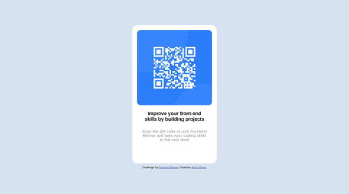
Hi, This was my first attempt at a project on Frontend Mentor. The css stuff has been a little difficult for me, sizing the different elements like the image and the container it is in still learning. Any input/feedback or tips is welcome. Thank you.

Code
Couldn’t fetch repository

Please log in to post a comment

Log in with GitHub

Community feedback

  • Kacper Kwinta•1,405
    @kacperkwinta
    Posted almost 2 years ago

    To improve your code and properly size the different elements, you can use the following techniques and best practices:

    1. Use the appropriate sizing units:
    • For the container and other block-level elements, you can use percentage values to make them responsive and adapt to different screen sizes. For example, you can set the width of the container to 90% to make it take up 90% of the available width.
    • For the image, you can use the max-width and max-height properties to make it responsive while maintaining its aspect ratio. This will ensure that the image scales down properly on smaller screens without distorting.
    • You can also consider using viewport-relative units like vw and vh to size elements relative to the viewport size. For example, you can set the height of the container to 80vh to make it take up 80% of the viewport height.
    1. Consider using the box-sizing property:
    • By default, the box-sizing property is set to content-box, which means that the width and height of an element are calculated based on its content, padding, and border. This can sometimes lead to unexpected sizing behavior.
    • To simplify sizing calculations and make your layout more intuitive, you can set the box-sizing property to border-box. This means that the width and height of an element include its content, padding, and border. This can help ensure that the specified dimensions are applied consistently across different elements.
    1. Experiment with different font sizes and spacing:
    • Adjust the font sizes of the headings and paragraphs to achieve the desired visual hierarchy and readability. You can use units like px, em, rem, or even vw for responsive text sizing.
    • Consider adding appropriate line-height and letter-spacing values to improve readability and visual appeal. These properties can be adjusted for different elements based on your design requirements.

    Sources:

    • MDN Web Docs - Sizing items in CSS
    • MDN Web Docs - box-sizing
    • Web.dev - Sizing
    • HubSpot Blog - CSS font-size
    Marked as helpful

Join our Discord community

Join thousands of Frontend Mentor community members taking the challenges, sharing resources, helping each other, and chatting about all things front-end!

Join our Discord
Frontend Mentor logo

Stay up to datewith new challenges, featured solutions, selected articles, and our latest news

Frontend Mentor

  • Unlock Pro
  • Contact us
  • FAQs
  • Become a partner

Explore

  • Learning paths
  • Challenges
  • Solutions
  • Articles

Community

  • Discord
  • Guidelines

For companies

  • Hire developers
  • Train developers
© Frontend Mentor 2019 - 2025
  • Terms
  • Cookie Policy
  • Privacy Policy
  • License

Oops! 😬

You need to be logged in before you can do that.

Log in with GitHub

Oops! 😬

You need to be logged in before you can do that.

Log in with GitHub

How does the accessibility report work?

When a solution is submitted, we use axe-core to run an automated audit of your code.

This picks out common accessibility issues like not using semantic HTML and not having proper heading hierarchies, among others.

This automated audit is fairly surface level, so we encourage to you review the project and code in more detail with accessibility best practices in mind.

How does the CSS report work?

When a solution is submitted, we use stylelint to run an automated check on the CSS code.

We've added some of our own linting rules based on recommended best practices. These rules are prefixed with frontend-mentor/ which you'll see at the top of each issue in the report.

The report will audit 1st-party linked stylesheets, and styles within <style> tags.

How does the HTML validation report work?

When a solution is submitted, we use html-validate to run an automated check on the HTML code.

The report picks out common HTML issues such as not using headings within section elements and incorrect nesting of elements, among others.

Note that the report can pick up “invalid” attributes, which some frameworks automatically add to the HTML. These attributes are crucial for how the frameworks function, although they’re technically not valid HTML. As such, some projects can show up with many HTML validation errors, which are benign and are a necessary part of the framework.

Oops! 😬

You need to be logged in before you can do that.

Log in with GitHub