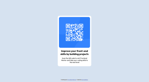
QR Code Page Solution using HTML and Vanilla CSS

Solution retrospective
It took me FOREVER to figure out how to vertically center the container div. I kinda threw "display:flex" on several different things, trying to get it to work (I'm new at this, if you can't tell). Is there any better way to consistently vertically align things without having to use flexbox, or is that the main way to do it?
Any other feedback is also greatly appreciated! I'm really wanting to get better at this, so feel free to tear my code apart and let me know everything I did wrong :)
Please log in to post a comment
Log in with GitHubCommunity feedback
- @ogulcanyavuz00
I am new in this stuff, but here we go!
A great looking product. It looks almost identical. Still, you can fix two minor problems about the color property. Try to give your h1 and p elements these values:
- h1 { color: hsl(218, 44%, 22%); }
- p { color: hsl(220, 15%, 55%); } This would make reading easier.
About centering your div, I guess using either flex or grid is the most modern way to apply. as your div.container (or <div class="container">) is inside main, your main works as a flex container so you should work on that. I worked around your code and the method below worked for me.
html { height: 100%; }
body { height: 100%; }
main { height: 100%; display: flex; justify-content: center; align-items: center; }
Marked as helpful - @Hassiai
There is no need to style the main, To center .container on the page using flexbox, add min-height:100vh; display: flex; align-items: center: justify-content: center; to the body.
To center .container on the page using flexbox:
body{
min-height: 100vh;
display: flex;
align-items: center;
justify-content: center;
}
There is no need to give .container a margin and increase it padding value to 15px.
For a responsive content, replace the width in .container and the img with a max-width. Give h1 and p the same font-size of 15px and the same margin-left, margin-right and margin-top values. Give p a margin bottom value.
Use relative units like rem or em as unit for the padding, margin, width values and preferably rem for the font-size values, instead of using px which is an absolute unit. For more on CSS units Click here
Hope am helpful.
Well done for completing this challenge. HAPPY CODING
Marked as helpful


Join our Discord community
Join thousands of Frontend Mentor community members taking the challenges, sharing resources, helping each other, and chatting about all things front-end!
Join our Discord